Android-ボタンの枠
回答:
手順1:my_button_bg.xmlという名前のファイルを作成する
ステップ2:このファイルをres / drawables.xmlに配置します
ステップ3:コードの下に挿入
<?xml version="1.0" encoding="utf-8"?>
<shape xmlns:android="http://schemas.android.com/apk/res/android"
  android:shape="rectangle">
  <gradient android:startColor="#FFFFFF"
    android:endColor="#00FF00"
    android:angle="270" />
  <corners android:radius="3dp" />
  <stroke android:width="5px" android:color="#000000" />
</shape>
ステップ4:必要に応じてコード "android:background =" @ drawable / my_button_bg "を使用します。例:
<Button
    android:layout_width="wrap_content"
    android:layout_height="wrap_content"
    android:text="Your Text"
    android:background="@drawable/my_button_bg"
/>• Android Official Solution
以来Androidの設計支援V28が導入された、それは使用して縁取りボタンを簡単に作成できますMaterialButton。このクラスは、コンストラクターのボタンの更新されたMaterialスタイルを提供します。を使用app:strokeColorしapp:strokeWidthて、次のようにカスタム境界線を作成できます。
1.使用する場合androidx:
build.gradle
dependencies {
    implementation 'androidx.appcompat:appcompat:1.1.0'
    implementation 'com.google.android.material:material:1.0.0'
}
•ボーダーボタン:
<com.google.android.material.button.MaterialButton
    style="@style/Widget.AppCompat.Button.Colored"
    android:layout_width="wrap_content"
    android:layout_height="wrap_content"
    android:text="MATERIAL BUTTON"
    android:textSize="15sp"
    app:strokeColor="@color/green"
    app:strokeWidth="2dp" />
•塗りつぶされていない境界線付きボタン:
<com.google.android.material.button.MaterialButton
    style="@style/Widget.AppCompat.Button.Borderless"
    android:layout_width="wrap_content"
    android:layout_height="wrap_content"
    android:text="UNFILLED MATERIAL BUTTON"
    android:textColor="@color/green"
    android:textSize="15sp"
    app:backgroundTint="@android:color/transparent"
    app:cornerRadius="8dp"
    app:rippleColor="#33AAAAAA"
    app:strokeColor="@color/green"
app:strokeWidth="2dp" />2.使用する場合appcompat:
build.gradle
dependencies {
    implementation 'com.android.support:design:28.0.0'
}
style.xml
アプリケーションのテーマの継承を確認してくださいTheme.MaterialComponents代わりにTheme.AppCompat。
<style name="AppTheme" parent="Theme.MaterialComponents.Light.DarkActionBar">
    <!-- Customize your theme here. -->
</style>
•ボーダーボタン:
<android.support.design.button.MaterialButton
    android:layout_width="wrap_content"
    android:layout_height="wrap_content"
    android:text="MATERIAL BUTTON"
    android:textSize="15sp"
    app:strokeColor="@color/green"
    app:strokeWidth="2dp" />
•塗りつぶされていない境界線付きボタン:
<android.support.design.button.MaterialButton
style="@style/Widget.AppCompat.Button.Borderless"
android:layout_width="wrap_content"
android:layout_height="wrap_content"
android:text="UNFILLED MATERIAL BUTTON"
android:textColor="@color/green"
android:textSize="15sp"
app:backgroundTint="@android:color/transparent"
app:cornerRadius="8dp"
app:rippleColor="#33AAAAAA"
app:strokeColor="@color/green"
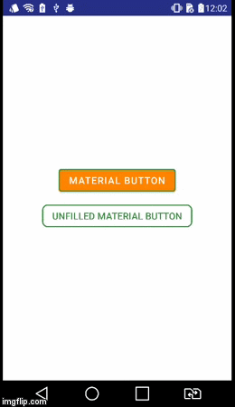
app:strokeWidth="2dp" />視覚的結果
style="@style/Widget.AppCompat.Button.Borderless"か?
button_border.xmlドローアブルフォルダーにファイルを作成します。
res / drawable / button_border.xml
<?xml version="1.0" encoding="utf-8"?>
<shape xmlns:android="http://schemas.android.com/apk/res/android"
    android:shape="rectangle" >

    <solid android:color="#FFDA8200" />

    <stroke
        android:width="3dp"
        android:color="#FFFF4917" />

</shape>XMLアクティビティレイアウトにボタンを追加し、背景を設定しますandroid:background="@drawable/button_border"。
        <Button
                android:layout_width="wrap_content"
                android:layout_height="wrap_content"
                android:background="@drawable/button_border"
android:text="Button Border" />drawable / button_green.xmlを作成します。
<?xml version="1.0" encoding="utf-8"?>
<shape xmlns:android="http://schemas.android.com/apk/res/android"
  android:shape="rectangle">
  <gradient
    android:startColor="#003000"
    android:centerColor="#006000"
    android:endColor="#003000"
    android:angle="270" />
  <corners android:radius="5dp" />
  <stroke android:width="2px" android:color="#007000" />
</shape>そしてそれを次のように指摘します@drawable/button_green:
<Button
        android:id="@+id/button1"
        android:layout_width="wrap_content"
        android:layout_height="wrap_content"
        android:layout_margin="10dp"
        android:background="@drawable/button_green"
android:text="Button" />シェイプドローアブルの作成については、こちらをご覧ください http://developer.android.com/guide/topics/resources/drawable-resource.html#Shape
これを行ったら、ボタンセットのXMLで android:background="@drawable/your_button_border"
ボタンが透明な背景を必要としない場合は、フレームレイアウトを使用して境界線のような錯覚を作成できます。FrameLayoutの「パディング」属性を調整して、境界線の太さを変更するだけです。
<FrameLayout
        android:layout_width="wrap_content"
        android:layout_height="wrap_content"
        android:padding="1sp"
        android:background="#000000">
        <Button
            android:layout_width="wrap_content"
            android:layout_height="wrap_content"
            android:text="Your text goes here"
            android:background="@color/white"
            android:textColor="@color/black"
            android:padding="10sp"
            />
</FrameLayout>
形状xmlファイルに動的に編集可能な境界線の色があるかどうかはわかりません。ただし、このソリューションでは、FrameLayoutの背景を設定することで境界線の色を動的に変更できることを知っています。
あなたのXMLレイアウトでは:
<Button
    android:id="@+id/cancelskill"
    android:layout_width="0dp"
    android:layout_height="wrap_content"
    android:layout_marginLeft="25dp"
    android:layout_weight="1"
    android:background="@drawable/button_border"
    android:padding="10dp"
    android:text="Cancel"
    android:textAllCaps="false"
    android:textColor="#ffffff"
    android:textSize="20dp" />
ドローアブルフォルダーで、ボタンのボーダースタイルのファイルを作成します。
<shape xmlns:android="http://schemas.android.com/apk/res/android"
    android:shape="rectangle" >
    <stroke
        android:width="1dp"
        android:color="#f43f10" />
</shape>
そしてあなたの活動で:
    GradientDrawable gd1 = new GradientDrawable();
    gd1.setColor(0xFFF43F10); // Changes this drawbale to use a single color instead of a gradient
    gd1.setCornerRadius(5);
    gd1.setStroke(1, 0xFFF43F10);

    cancelskill.setBackgroundDrawable(gd1);

    cancelskill.setOnClickListener(new View.OnClickListener() {

        @Override
        public void onClick(View v) {
            cancelskill.setBackgroundColor(Color.parseColor("#ffffff"));
            cancelskill.setTextColor(Color.parseColor("#f43f10"));

            GradientDrawable gd = new GradientDrawable();

            gd.setColor(0xFFFFFFFF); // Changes this drawbale to use a single color instead of a gradient
            gd.setCornerRadius(5);
            gd.setStroke(1, 0xFFF43F10);
            cancelskill.setBackgroundDrawable(gd);

            finish();
        }
});私はその年の後半について知っていますが、9パスの画像を作成することもできます。このような画像の作成に役立つAndroid SDKに付属のツールがあります。このリンクを参照してください。 http //developer.android.com/tools/help/draw9patch .html
PS:画像も無限に拡大縮小できます