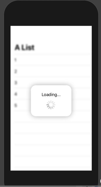
カスタムインジケーター
AppleはSwiftUI2.0からネイティブアクティビティインジケーターをサポートするようになりましたが、独自のアニメーションを実装するだけで済みます。これらはすべてSwiftUI1.0でサポートされています。また、ウィジェットでも機能します。
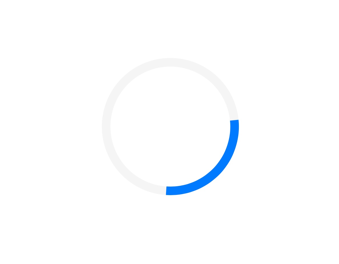
アーク
struct Arcs: View {
    @Binding var isAnimating: Bool
    let count: UInt
    let width: CGFloat
    let spacing: CGFloat

    var body: some View {
        GeometryReader { geometry in
            ForEach(0..<Int(count)) { index in
                item(forIndex: index, in: geometry.size)
                    .rotationEffect(isAnimating ? .degrees(360) : .degrees(0))
                    .animation(
                        Animation.default
                            .speed(Double.random(in: 0.2...0.5))
                            .repeatCount(isAnimating ? .max : 1, autoreverses: false)
                    )
            }
        }
        .aspectRatio(contentMode: .fit)
    }

    private func item(forIndex index: Int, in geometrySize: CGSize) -> some View {
        Group { () -> Path in
            var p = Path()
            p.addArc(center: CGPoint(x: geometrySize.width/2, y: geometrySize.height/2),
                     radius: geometrySize.width/2 - width/2 - CGFloat(index) * (width + spacing),
                     startAngle: .degrees(0),
                     endAngle: .degrees(Double(Int.random(in: 120...300))),
                     clockwise: true)
            return p.strokedPath(.init(lineWidth: width))
        }
        .frame(width: geometrySize.width, height: geometrySize.height)
    }
}
さまざまなバリエーションのデモ

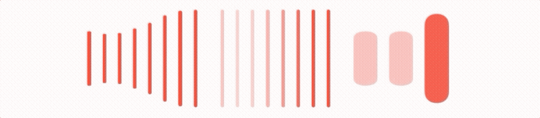
バー
struct Bars: View {
    @Binding var isAnimating: Bool
    let count: UInt
    let spacing: CGFloat
    let cornerRadius: CGFloat
    let scaleRange: ClosedRange<Double>
    let opacityRange: ClosedRange<Double>

    var body: some View {
        GeometryReader { geometry in
            ForEach(0..<Int(count)) { index in
                item(forIndex: index, in: geometry.size)
            }
        }
        .aspectRatio(contentMode: .fit)
    }

    private var scale: CGFloat { CGFloat(isAnimating ? scaleRange.lowerBound : scaleRange.upperBound) }
    private var opacity: Double { isAnimating ? opacityRange.lowerBound : opacityRange.upperBound }

    private func size(count: UInt, geometry: CGSize) -> CGFloat {
        (geometry.width/CGFloat(count)) - (spacing-2)
    }

    private func item(forIndex index: Int, in geometrySize: CGSize) -> some View {
        RoundedRectangle(cornerRadius: cornerRadius,  style: .continuous)
            .frame(width: size(count: count, geometry: geometrySize), height: geometrySize.height)
            .scaleEffect(x: 1, y: scale, anchor: .center)
            .opacity(opacity)
            .animation(
                Animation
                    .default
                    .repeatCount(isAnimating ? .max : 1, autoreverses: true)
                    .delay(Double(index) / Double(count) / 2)
            )
            .offset(x: CGFloat(index) * (size(count: count, geometry: geometrySize) + spacing))
    }
}
さまざまなバリエーションのデモ
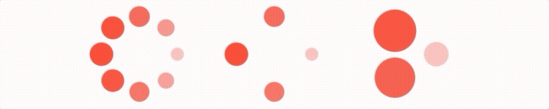
ブリンカー
struct Blinking: View {
    @Binding var isAnimating: Bool
    let count: UInt
    let size: CGFloat

    var body: some View {
        GeometryReader { geometry in
            ForEach(0..<Int(count)) { index in
                item(forIndex: index, in: geometry.size)
                    .frame(width: geometry.size.width, height: geometry.size.height)

            }
        }
        .aspectRatio(contentMode: .fit)
    }

    private func item(forIndex index: Int, in geometrySize: CGSize) -> some View {
        let angle = 2 * CGFloat.pi / CGFloat(count) * CGFloat(index)
        let x = (geometrySize.width/2 - size/2) * cos(angle)
        let y = (geometrySize.height/2 - size/2) * sin(angle)
        return Circle()
            .frame(width: size, height: size)
            .scaleEffect(isAnimating ? 0.5 : 1)
            .opacity(isAnimating ? 0.25 : 1)
            .animation(
                Animation
                    .default
                    .repeatCount(isAnimating ? .max : 1, autoreverses: true)
                    .delay(Double(index) / Double(count) / 2)
            )
            .offset(x: x, y: y)
    }
}
さまざまなバリエーションのデモ
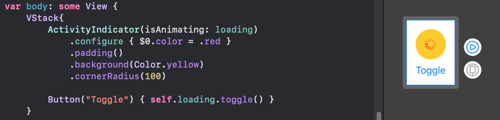
コードの壁を防ぐために、gitでホストされているこのリポジトリでよりエレガントなインジケーターを見つけることができます。
これらすべてのアニメーションを持っていることに注意してくださいBindingそのMUSTのトグルが実行されます。