FlutterのGridViewでウィジェットのカスタム高さを設定するにはどうすればよいですか?


87

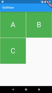
Container GridViewの高さを指定した後でも、私のコードは正方形のウィジェットを生成しています。

class MyHomePage extends StatefulWidget {
  MyHomePage({Key key, this.title}) : super(key: key);

  final String title;

  @override
  _MyHomePageState createState() => new _MyHomePageState();
}

class _MyHomePageState extends State<MyHomePage> {
  List<String> widgetList = ['A', 'B', 'C'];

  @override
  Widget build(BuildContext context) {
    return new Scaffold(
      appBar: new AppBar(
        title: new Text(widget.title),
      ),
      body: new Container(
        child: new GridView.count(
          crossAxisCount: 2,
          controller: new ScrollController(keepScrollOffset: false),
          shrinkWrap: true,
          scrollDirection: Axis.vertical,
          children: widgetList.map((String value) {
            return new Container(
              height: 250.0,
              color: Colors.green,
              margin: new EdgeInsets.all(1.0),
              child: new Center(
                child: new Text(
                  value,
                  style: new TextStyle(fontSize: 50.0,color: Colors.white),
                ),
              ),
            );
          }).toList(),
        ),
      ),
    );
  }
}

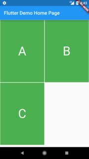
上記のコードの出力は、左に示すとおりです。右に示すように、カスタムの高さウィジェットを備えたGridViewを取得するにはどうすればよいですか?

出力 必要な出力


回答:


160

キーはchildAspectRatioです。この値は、のレイアウトを決定するために使用されGridViewます。目的のアスペクトを取得するには、(itemWidth/ itemHeight)に設定する必要があります。解決策は次のとおりです。

class MyHomePage extends StatefulWidget {
  MyHomePage({Key key, this.title}) : super(key: key);

  final String title;

  @override
  _MyHomePageState createState() => new _MyHomePageState();
}

class _MyHomePageState extends State<MyHomePage> {
  List<String> widgetList = ['A', 'B', 'C'];

  @override
  Widget build(BuildContext context) {
    var size = MediaQuery.of(context).size;

    /*24 is for notification bar on Android*/
    final double itemHeight = (size.height - kToolbarHeight - 24) / 2;
    final double itemWidth = size.width / 2;

    return new Scaffold(
      appBar: new AppBar(
        title: new Text(widget.title),
      ),
      body: new Container(
        child: new GridView.count(
          crossAxisCount: 2,
          childAspectRatio: (itemWidth / itemHeight),
          controller: new ScrollController(keepScrollOffset: false),
          shrinkWrap: true,
          scrollDirection: Axis.vertical,
          children: widgetList.map((String value) {
            return new Container(
              color: Colors.green,
              margin: new EdgeInsets.all(1.0),
              child: new Center(
                child: new Text(
                  value,
                  style: new TextStyle(
                    fontSize: 50.0,
                    color: Colors.white,
                  ),
                ),
              ),
            );
          }).toList(),
        ),
      ),
    );
  }
}

ご回答ありがとうございます。1時間節約
DhruvamSharma20年

あなたがカウント方法をやっている場合を除きGridViewのプロパティchildAspectRatioを持っていない: - /
オリバー・ディクソン

1
@OliverDixonあなたが使用している場合GridView.builderSliverGridDelegateWithFixedCrossAxisCount、その後はchildAspectRatio上にあるgridDelegate
笛を吹く少年の羊

1
この高さを動的にする方法は?
ダニ

15

数日前、インターネットから画像を読み込んだときに高さを動的に変更する方法を見つけるためにここに来ましたが、childAspectRatioGridViewのすべてのウィジェットに適用されるため(それぞれ同じ高さ)、使用できません。

この回答は、ウィジェットのコンテンツごとに異なる高さを必要とする人に役立つ可能性があります。

RomainRastelによるFlutterStaggeredGridViewというパッケージを見つけました。このパッケージを使用すると、ここで例を確認することができます。

使用できるものStaggeredGridView.count()とそのプロパティを取得staggeredTiles:し、その値を取得するには、すべてのウィジェットをマップして適用しますStaggeredTile.fit(2)

コード例:

StaggeredGridView.count(
    crossAxisCount: 4, // I only need two card horizontally
    padding: const EdgeInsets.all(2.0),
    children: yourList.map<Widget>((item) {
      //Do you need to go somewhere when you tap on this card, wrap using InkWell and add your route
      return new Card(
        child: Column(
          children: <Widget>[
             Image.network(item.yourImage),
             Text(yourList.yourText),//may be the structure of your data is different
          ],
        ),
      );
    }).toList(),

    //Here is the place that we are getting flexible/ dynamic card for various images
    staggeredTiles: yourList.map<StaggeredTile>((_) => StaggeredTile.fit(2))
        .toList(),
    mainAxisSpacing: 3.0,
    crossAxisSpacing: 4.0, // add some space
  ),
);

完全な例(コピー、貼り付け、実行)はここにあります


8

crossAxisCountcrossAxisSpacingおよび画面幅がを決定しwidth、を childAspectRatio決定しheightます。

私はそれらの間の関係を理解するために少し計算をしました。

var width = (screenWidth - ((_crossAxisCount - 1) * _crossAxisSpacing)) / _crossAxisCount;
var height = width / _aspectRatio;

完全な例:

double _crossAxisSpacing = 8, _mainAxisSpacing = 12, _aspectRatio = 2;
int _crossAxisCount = 2;

@override
Widget build(BuildContext context) {
  double screenWidth = MediaQuery.of(context).size.width;

  var width = (screenWidth - ((_crossAxisCount - 1) * _crossAxisSpacing)) / _crossAxisCount;
  var height = width / _aspectRatio;

  return Scaffold(
    body: GridView.builder(
      itemCount: 10,
      itemBuilder: (context, index) => Container(color: Colors.blue[((index) % 9) * 100]),
      gridDelegate: SliverGridDelegateWithFixedCrossAxisCount(
        crossAxisCount: _crossAxisCount,
        crossAxisSpacing: _crossAxisSpacing,
        mainAxisSpacing: _mainAxisSpacing,
        childAspectRatio: _aspectRatio,
      ),
    ),
  );
}

5

ここに画像の説明を入力してください

それは私のために働いています。

コード例:

var _crossAxisSpacing = 8;
var _screenWidth = MediaQuery.of(context).size.width;
var _crossAxisCount = 2;
var _width = ( _screenWidth - ((_crossAxisCount - 1) * _crossAxisSpacing)) / _crossAxisCount;
var cellHeight = 60;
var _aspectRatio = _width /cellHeight;

グリッドビュー:

         GridView.builder(
                          padding: EdgeInsets.only(
                              left: 5.0, right: 5.0, top: 10, bottom: 10),
                          shrinkWrap: false,
                          itemCount: searchList.length,
                          gridDelegate:
                              SliverGridDelegateWithFixedCrossAxisCount(crossAxisCount: _crossAxisCount,childAspectRatio: _aspectRatio),
                          itemBuilder: (context, index) {
                            final item = searchList[index];
                            return Card(
                              child: ListTile(
                                title: Text(item.name,maxLines: 1,overflow: TextOverflow.ellipsis),
                                trailing: Container(
                                  width: 15,
                                  height: 15,
                                  decoration: BoxDecoration(
                                      color: item.isActive == true
                                          ? Theme.of(context).primaryColor
                                          : Colors.red,
                                      borderRadius: BorderRadius.all(
                                          Radius.circular(50))),
                                ),
                                onTap: () {

                                },
                              ),
                              elevation: 0.5,
                            );
                          },
                        ) 
弊社のサイトを使用することにより、あなたは弊社のクッキーポリシーおよびプライバシーポリシーを読み、理解したものとみなされます。
Licensed under cc by-sa 3.0 with attribution required.