ラジオボタンの色を変更するにはどうすればよいですか?
回答:
ラジオボタンは、各OS /ブラウザに固有のネイティブ要素です。カスタム画像を実装したり、画像を含むカスタムJavascriptライブラリ(この - キャッシュされたリンクなど)を使用したりしない限り、色やスタイルを変更する方法はありません。
簡単な修正は、を使用してラジオボタン入力スタイルをオーバーレイすることですが:after、独自のカスタムツールキットを作成することをお勧めします。
    input[type='radio']:after {
        width: 15px;
        height: 15px;
        border-radius: 15px;
        top: -2px;
        left: -1px;
        position: relative;
        background-color: #d1d3d1;
        content: '';
        display: inline-block;
        visibility: visible;
        border: 2px solid white;
    }

    input[type='radio']:checked:after {
        width: 15px;
        height: 15px;
        border-radius: 15px;
        top: -2px;
        left: -1px;
        position: relative;
        background-color: #ffa500;
        content: '';
        display: inline-block;
        visibility: visible;
        border: 2px solid white;
    }
<input type='radio' name="gender"/>
<input type='radio' name="gender"/>フレッドが述べたように、色、サイズなどに関してラジオボタンをネイティブにスタイルする方法はありません。ただし、CSS Pseudo要素を使用して、任意のラジオボタンのなりすましを設定し、スタイルを設定できます。JamieDが言ったことに触れ、:after Pseudo要素をどのように使用できるかについては、:beforeと:afterの両方を使用して望ましい外観を実現できます。
このアプローチの利点:
- ラジオボタンのスタイルを設定し、コンテンツのラベルも含めます。
- 外縁の色やチェックされた円を好きな色に変更します。
- 背景色プロパティを変更したり、オプションで不透明度プロパティを使用したりして、透明な外観にします。
- ラジオボタンのサイズを調整します。
- 必要に応じて、CSSドロップシャドウインセットなどのさまざまなドロップシャドウプロパティを追加します。
- このシンプルなCSS / HTMLトリックをBootstrap 3.3.6などのさまざまなグリッドシステムにブレンドして、他のBootstrapコンポーネントと視覚的に一致させます。
以下の短いデモの説明:
- ラジオボタンごとに相対インラインブロックを設定する
- ネイティブラジオボタンのセンスを非表示にすると、直接スタイルを設定する方法がありません。
- ラベルのスタイルと位置合わせ
- :before Pseudo-elementでCSSコンテンツを再構築して2つのことを行う-ラジオボタンの外縁をスタイルし、最初に表示されるように要素を設定します(ラベルコンテンツの左側)。ここで、疑似要素の基本的な手順を学ぶことができます- ://www.w3schools.com/css/css_pseudo_elements.asp
- ラジオボタンがチェックされている場合、CSSコンテンツ(ラジオボタンのスタイル付きドット)を表示するためのラベルを要求します。
HTML
<div class="radio-item">
    <input type="radio" id="ritema" name="ritem" value="ropt1">
    <label for="ritema">Option 1</label>
</div>

<div class="radio-item">
    <input type="radio" id="ritemb" name="ritem" value="ropt2">
    <label for="ritemb">Option 2</label>
</div>
CSS
.radio-item {
  display: inline-block;
  position: relative;
  padding: 0 6px;
  margin: 10px 0 0;
}

.radio-item input[type='radio'] {
  display: none;
}

.radio-item label {
  color: #666;
  font-weight: normal;
}

.radio-item label:before {
  content: " ";
  display: inline-block;
  position: relative;
  top: 5px;
  margin: 0 5px 0 0;
  width: 20px;
  height: 20px;
  border-radius: 11px;
  border: 2px solid #004c97;
  background-color: transparent;
}

.radio-item input[type=radio]:checked + label:after {
  border-radius: 11px;
  width: 12px;
  height: 12px;
  position: absolute;
  top: 9px;
  left: 10px;
  content: " ";
  display: block;
  background: #004c97;
}短いデモ実際の動作を確認
結論として、JavaScript、画像、バッテリーは必要ありません。純粋なCSS。
Webkitベースのブラウザー(ChromeとSafari、おそらく知っているChrome WebAppを開発している)をターゲットにしている場合のみ、以下を使用できます。
input[type='radio'] {
   -webkit-appearance: none;
}
次に、単純なHTML要素のようにスタイルを設定します。たとえば、背景画像を適用します。
input[type='radio']:active入力が選択されたときに使用し、代替グラフィックスを提供します
更新:2018年以降、以下を追加して複数のブラウザーベンダーをサポートできます。
input[type="radio"] {
  -webkit-appearance: none;
  -moz-appearance: none;
  appearance: none;
}:active、:checked「選択された」ラジオボタン間のスタイルを区別する必要があります。
カスタマイズされたラジオボタンを2つの純粋なCSS方法で実現できます。
CSS
appearanceを使用して標準の外観を削除し、カスタムの外観を適用する。残念ながら、これはIE for Desktopでは機能しませんでした(ただし、Windows PhoneのIEでは機能します)。デモ:input[type="radio"] { /* remove standard background appearance */ -webkit-appearance: none; -moz-appearance: none; appearance: none; /* create custom radiobutton appearance */ display: inline-block; width: 25px; height: 25px; padding: 6px; /* background-color only for content */ background-clip: content-box; border: 2px solid #bbbbbb; background-color: #e7e6e7; border-radius: 50%; } /* appearance for checked radiobutton */ input[type="radio"]:checked { background-color: #93e026; } /* optional styles, I'm using this for centering radiobuttons */ .flex { display: flex; align-items: center; }<div class="flex"> <input type="radio" name="radio" id="radio1" /> <label for="radio1">RadioButton1</label> </div> <div class="flex"> <input type="radio" name="radio" id="radio2" /> <label for="radio2">RadioButton2</label> </div> <div class="flex"> <input type="radio" name="radio" id="radio3" /> <label for="radio3">RadioButton3</label> </div>ラジオボタンを非表示にし、カスタムラジオボタンの外観を
labelの疑似セレクターに設定します。ちなみに、ここでは絶対配置は必要ありません(ほとんどのデモで絶対配置を確認しています)。デモ:*, *:before, *:after { box-sizing: border-box; } input[type="radio"] { display: none; } input[type="radio"]+label:before { content: ""; /* create custom radiobutton appearance */ display: inline-block; width: 25px; height: 25px; padding: 6px; margin-right: 3px; /* background-color only for content */ background-clip: content-box; border: 2px solid #bbbbbb; background-color: #e7e6e7; border-radius: 50%; } /* appearance for checked radiobutton */ input[type="radio"]:checked + label:before { background-color: #93e026; } /* optional styles, I'm using this for centering radiobuttons */ label { display: flex; align-items: center; }<input type="radio" name="radio" id="radio1" /> <label for="radio1">RadioButton1</label> <input type="radio" name="radio" id="radio2" /> <label for="radio2">RadioButton2</label> <input type="radio" name="radio" id="radio3" /> <label for="radio3">RadioButton3</label>
あなたはcssトリックで説明されているようにチェックボックスハックを使用できます
http://css-tricks.com/the-checkbox-hack/
ラジオボタンの使用例:
http://codepen.io/Angelata/pen/Eypnq
input[type=radio]:checked ~ .check {}
input[type=radio]:checked ~ .check .inside{}
IE9以降、Firefox 3.5以降、Safari 1.3以降、Opera 6以降、Chromeで動作します。
単純なクロスブラウザーカスタムラジオボタンの例
.checkbox input{
    display: none;
}
.checkbox input:checked + label{
    color: #16B67F;
}
.checkbox input:checked + label i{
    background-image: url('http://kuzroman.com/images/jswiddler/radio-button.svg');
}
.checkbox label i{
    width: 15px;
    height: 15px;
    display: inline-block;
    background: #fff url('http://kuzroman.com/images/jswiddler/circle.svg') no-repeat 50%;
    background-size: 12px;
    position: relative;
    top: 1px;
    left: -2px;
}
<div class="checkbox">
<input type="radio" name="sort" value="popularity" id="sort1">
<label for="sort1">
<i></i>
<span>first</span>
</label>
<input type="radio" name="sort" value="price" id="sort2">
<label for="sort2">
<i></i>
<span>second</span>
</label>
</div>トランジションでこのCSSを試してください:
$DarkBrown: #292321;

$Orange: #CC3300;

div {
  margin:0 0 0.75em 0;
}

input[type="radio"] {
    display:none;
}
input[type="radio"] + label {
    color: $DarkBrown;
    font-family:Arial, sans-serif;
    font-size:14px;
}
input[type="radio"] + label span {
    display:inline-block;
    width:19px;
    height:19px;
    margin:-1px 4px 0 0;
    vertical-align:middle;
    cursor:pointer;
    -moz-border-radius:  50%;
    border-radius:  50%;
}

input[type="radio"] + label span {
     background-color:$DarkBrown;
}

input[type="radio"]:checked + label span{
     background-color:$Orange;
}

input[type="radio"] + label span,
input[type="radio"]:checked + label span {
  -webkit-transition:background-color 0.4s linear;
  -o-transition:background-color 0.4s linear;
  -moz-transition:background-color 0.4s linear;
  transition:background-color 0.4s linear;
}
HTML:
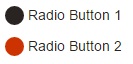
<div>
  <input type="radio" id="radio01" name="radio" />
  <label for="radio01"><span></span>Radio Button 1</label>
</div>

<div>
 <input type="radio" id="radio02" name="radio" />
 <label for="radio02"><span></span>Radio Button 2</label>
</div>@ before /:after疑似要素と非表示のラジオ入力ボタンを使用して、純粋なcssとグラデーションで遊んでいることを示すために、@ klewisのコードサンプルの別のフォークを作成しました。

HTML:
sample radio buttons:
<div style="background:lightgrey;">
    <span class="radio-item">
        <input type="radio" id="ritema" name="ritem" class="true" value="ropt1" checked="checked">
        <label for="ritema">True</label>
    </span>

    <span class="radio-item">
        <input type="radio" id="ritemb" name="ritem" class="false" value="ropt2">
        <label for="ritemb">False</label>
    </span>
</div>
:
CSS:
.radio-item input[type='radio'] {
    visibility: hidden;
    width: 20px;
    height: 20px;
    margin: 0 5px 0 5px;
    padding: 0;
}
    .radio-item input[type=radio]:before {
        position: relative;
        margin: 4px -25px -4px 0;
        display: inline-block;
        visibility: visible;
        width: 20px;
        height: 20px;
        border-radius: 10px;
        border: 2px inset rgba(150,150,150,0.75);
        background: radial-gradient(ellipse at top left, rgb(255,255,255) 0%, rgb(250,250,250) 5%, rgb(230,230,230) 95%, rgb(225,225,225) 100%);
        content: "";
    }
        .radio-item input[type=radio]:checked:after {
            position: relative;
            top: 0;
            left: 9px;
            display: inline-block;
            visibility: visible;
            border-radius: 6px;
            width: 12px;
            height: 12px;
            background: radial-gradient(ellipse at top left, rgb(245,255,200) 0%, rgb(225,250,100) 5%, rgb(75,175,0) 95%, rgb(25,100,0) 100%);
            content: "";
        }
            .radio-item input[type=radio].true:checked:after {
                background: radial-gradient(ellipse at top left, rgb(245,255,200) 0%, rgb(225,250,100) 5%, rgb(75,175,0) 95%, rgb(25,100,0) 100%);
            }
            .radio-item input[type=radio].false:checked:after {
                background: radial-gradient(ellipse at top left, rgb(255,225,200) 0%, rgb(250,200,150) 5%, rgb(200,25,0) 95%, rgb(100,25,0) 100%);
            }
.radio-item label {
    display: inline-block;
    height: 25px;
    line-height: 25px;
    margin: 0;
    padding: 0;
}プレビュー:https : //www.codeply.com/p/y47T4ylfib
他の人が言ったように、すべてのブラウザでこれを実現する方法はないので、そうするための最良の方法は、クロスブラウザがJavaScriptを控えめに使用することです。基本的に、ラジオボタンをリンクに変換する必要があります(CSSで完全にカスタマイズ可能)。リンクをクリックするたびに、関連するラジオボックスにバインドされ、彼の状態とその他すべての状態が切り替わります。
無線入力にスパン要素を埋め込んでから、無線入力がチェックされたときにレンダリングする任意の色を選択できます。w3schoolsからの以下の例を確認してください。
<!DOCTYPE html>
<html>
<style>
/* The container */
.container {
  display: block;
  position: relative;
  padding-left: 35px;
  margin-bottom: 12px;
  cursor: pointer;
  font-size: 22px;
  -webkit-user-select: none;
  -moz-user-select: none;
  -ms-user-select: none;
  user-select: none;
}

/* Hide the browser's default radio button */
.container input {
  position: absolute;
  opacity: 0;
  cursor: pointer;
}

/* Create a custom radio button */
.checkmark {
  position: absolute;
  top: 0;
  left: 0;
  height: 25px;
  width: 25px;
  background-color: #eee;
  border-radius: 50%;
}

/* On mouse-over, add a grey background color */
.container:hover input ~ .checkmark {
  background-color: #ccc;
}

/* When the radio button is checked, add a blue background */
.container input:checked ~ .checkmark {
  background-color: #00a80e;
}

/* Create the indicator (the dot/circle - hidden when not checked) */
.checkmark:after {
  content: "";
  position: absolute;
  display: none;
}

/* Show the indicator (dot/circle) when checked */
.container input:checked ~ .checkmark:after {
  display: block;
}

/* Style the indicator (dot/circle) */
.container .checkmark:after {
    top: 9px;
    left: 9px;
    width: 8px;
    height: 8px;
    border-radius: 50%;
    background: white;
}
</style>
<body>

<h1>Custom Radio Buttons</h1>
<label class="container">One
  <input type="radio" checked="checked" name="radio">
  <span class="checkmark"></span>
</label>
<label class="container">Two
  <input type="radio" name="radio">
  <span class="checkmark"></span>
</label>
<label class="container">Three
  <input type="radio" name="radio">
  <span class="checkmark"></span>
</label>
<label class="container">Four
  <input type="radio" name="radio">
  <span class="checkmark"></span>
</label>

</body>
以下のこのコードセグメントで背景色を変更すると、うまくいきます。
/* When the radio button is checked, add a blue background */
.container input:checked ~ .checkmark {
  background-color: #00a80e;
}簡単な修正は、次のCSSプロパティを使用することです。
input[type=radio]:checked{
    background: \*colour*\;
    border-radius: 15px;
    border: 4px solid #dfdfdf;
}