フレックスボックス:水平および垂直に中央揃え


669

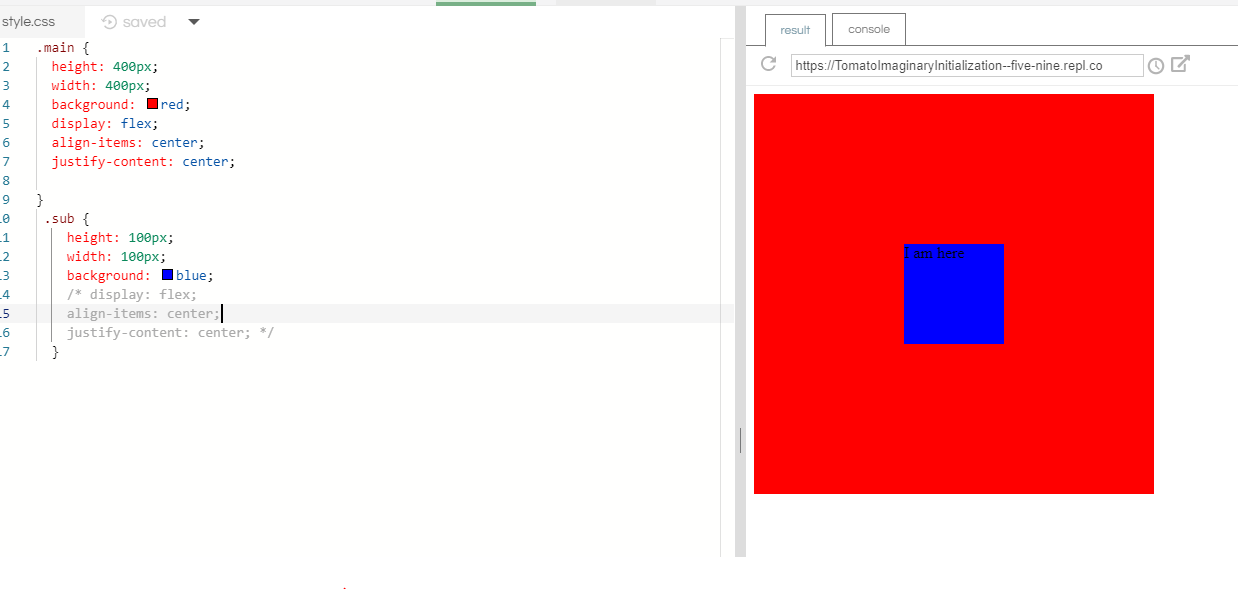
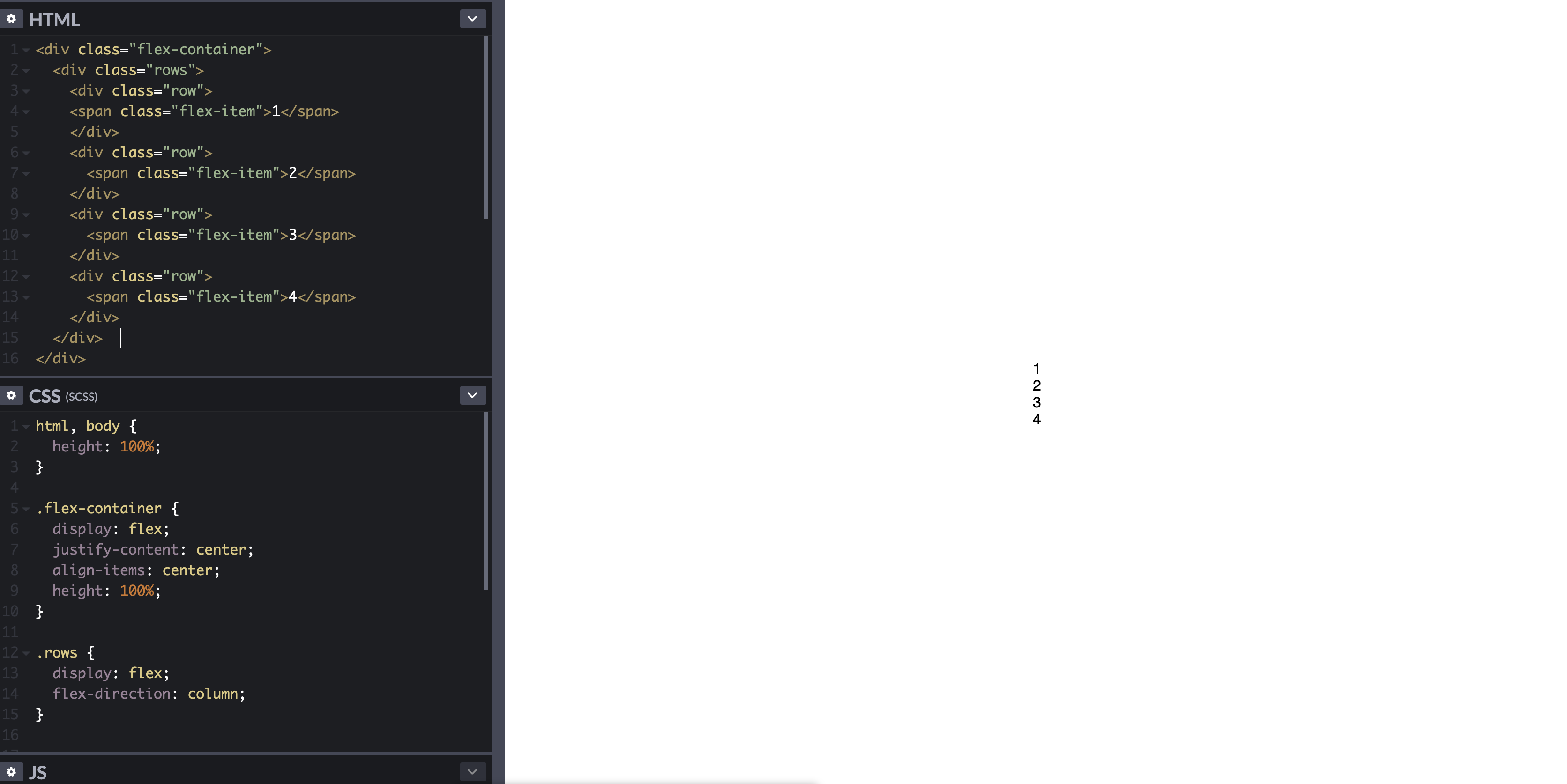
フレックスボックスを使用して、divをコンテナ内で水平方向および垂直方向の中央に配置する方法。以下の例では、水平方向の中央に配置された各行の下(行)に各数値が必要です。

.flex-container {
  padding: 0;
  margin: 0;
  list-style: none;
  display: flex;
  align-items: center;
  justify-content: center;
}
row {
  width: 100%;
}
.flex-item {
  background: tomato;
  padding: 5px;
  width: 200px;
  height: 150px;
  margin: 10px;
  line-height: 150px;
  color: white;
  font-weight: bold;
  font-size: 3em;
  text-align: center;
}
<div class="flex-container">
  <div class="row">
    <span class="flex-item">1</span>
  </div>
  <div class="row">
    <span class="flex-item">2</span>
  </div>
  <div class="row">
    <span class="flex-item">3</span>
  </div>
  <div class="row">
    <span class="flex-item">4</span>
  </div>
</div>

http://codepen.io/anon/pen/zLxBo


あなたのCSSでは、row{行に影響を与えません。変更すると.row{結果が全く異なります。
Hamid Mayeli、

回答:


750

次のようなものが欲しいと思います。

html, body {
    height: 100%;
}
body {
    margin: 0;
}
.flex-container {
    height: 100%;
    padding: 0;
    margin: 0;
    display: -webkit-box;
    display: -moz-box;
    display: -ms-flexbox;
    display: -webkit-flex;
    display: flex;
    align-items: center;
    justify-content: center;
}
.row {
    width: auto;
    border: 1px solid blue;
}
.flex-item {
    background-color: tomato;
    padding: 5px;
    width: 20px;
    height: 20px;
    margin: 10px;
    line-height: 20px;
    color: white;
    font-weight: bold;
    font-size: 2em;
    text-align: center;
}
<div class="flex-container">
    <div class="row"> 
        <div class="flex-item">1</div>
        <div class="flex-item">2</div>
        <div class="flex-item">3</div>
        <div class="flex-item">4</div>
    </div>
</div>

デモを参照してください:http : //jsfiddle.net/audetwebdesign/tFscL/

あなたの.flex-item要素は、(ブロックレベルでなければなりませんdiv代わりに、spanあなたが適切に動作する高さと、トップ/ボトムのパディングをしたい場合)。

また、では.row、幅をのauto代わりにに設定し100%ます。

あなたの.flex-containerプロパティは大丈夫です。

.rowビューポートの垂直方向の中央に配置する場合は、htmlおよびに100%の高さを割り当てbodybodyマージンもゼロにします。

.flex-containerは垂直方向の配置効果を表示するために高さが必要であることに注意してください。そうでない場合、コンテナはコンテンツを囲むために必要な最小の高さを計算します。これは、この例ではビューポートの高さよりも低くなっています。

脚注:、、プロパティは実装が、このデザインは簡単に作ることができます。要素(背景画像、境界線など)の周りにスタイルを追加する必要がない限り、コンテナーは必要ないと思います。
flex-flowflex-directionflex-wrap.row

役立つリソースは次のとおりです。http//demo.agektmr.com/flexbox/


5
フレックスアイテムは、それらが含むコンテンツで必要とされない限り、ブロックレベルである必要はありません。また、すべての表示プロパティにプレフィックスを付けましたが、他のFlexboxプロパティにはプレフィックスを付けていません(他のドラフトでは名前が異なります)。
cimmanon 2013

1
@cimmanonブロックレベルについてあなたに同意し、それに応じて投稿を編集しました。ブロックレベルは位置合わせには必要ありませんが、ユーザーが高さなどを指定する場合に必要になることがあります。私はブラウザのプレフィックスについて自由をとり、実際のデモにたどり着くために完璧なブラウザであると想定しました。コメントをありがとうございます。フィードバックに感謝します。
Marc Audet 2013

1
オーバーフローする場合は、上部をトリミングします。 i.imgur.com/3dgFfQK.pngこれを回避する方法はありますか?
ブライアンゲート

1
@BrianGatesウィンドウの高さが短すぎる場合、4つの要素、2x2、1x4をどのように表示しますか?
Marc Audet 2014

2
ソリューションはここにある:stackoverflow.com/questions/24538100/...
ブライアン・ゲイツ

252

Flexboxで要素を垂直方向および水平方向に中央揃えする方法

以下は、2つの一般的なセンタリングソリューションです。

1つは垂直方向に配置されたフレックスアイテム用(flex-direction: column)で、もう1つは水平方向に配置されたフレックスアイテム用(flex-direction: row)です。

どちらの場合でも、中央に配置されたdivの高さは、可変、未定義、不明など、さまざまです。中央のdivの高さは関係ありません。

両方のHTMLは次のとおりです。

<div id="container"><!-- flex container -->

    <div class="box" id="bluebox"><!-- flex item -->
        <p>DIV #1</p>
    </div>

    <div class="box" id="redbox"><!-- flex item -->
        <p>DIV #2</p>
    </div>

</div>

CSS(装飾的なスタイルを除く)

フレックスアイテムが垂直に積み重ねられている場合:

#container {
    display: flex;           /* establish flex container */
    flex-direction: column;  /* make main axis vertical */
    justify-content: center; /* center items vertically, in this case */
    align-items: center;     /* center items horizontally, in this case */
    height: 300px;
}

.box {
    width: 300px;
    margin: 5px;
    text-align: center;     /* will center text in <p>, which is not a flex item */
}

ここに画像の説明を入力してください

デモ


フレックスアイテムが水平に積み重ねられている場合:

flex-direction上記のコードからルールを調整します。

#container {
    display: flex;
    flex-direction: row;     /* make main axis horizontal (default setting) */
    justify-content: center; /* center items horizontally, in this case */
    align-items: center;     /* center items vertically, in this case */
    height: 300px;
}

ここに画像の説明を入力してください

デモ


フレックスアイテムのコンテンツの中央揃え

フレックスフォーマットコンテキストの範囲は、親子関係に制限されています。子を超えたフレックスコンテナの子孫はフレックスレイアウトに参加せず、フレックスプロパティを無視します。基本的に、フレックスプロパティは子を超えて継承できません。

したがって、フレックスプロパティを子に適用するには、常に、display: flexまたはdisplay: inline-flex親要素に適用する必要があります。

フレックスアイテムに含まれるテキストまたは他のコンテンツを垂直方向または水平方向、あるいはその両方に中央揃えするには、アイテムを(ネストされた)フレックスコンテナーにして、中央揃えのルールを繰り返します。

.box {
    display: flex;
    justify-content: center;
    align-items: center;        /* for single line flex container */
    align-content: center;      /* for multi-line flex container */
}

詳細はこちら:フレックスボックス内のテキストを垂直方向に配置する方法は?

または、margin: autoフレックスアイテムのコンテンツ要素に適用することもできます。

p { margin: auto; }

フレックスautoマージンについては、こちらをご覧ください:フレックスアイテムの整列方法(box#56を参照)。


フレックスアイテムの複数行の中央揃え

フレックスコンテナーに複数の行がある場合(折り返しのため)、align-contentプロパティは軸間の配置に必要です。

スペックから:

8.4。フレックスラインのパッキング:align-content プロパティ

align-contentフレックスコンテナ内のフレックスコンテナのライン整列プロパティは、いつどのように似たクロス軸に余分なスペースがあり、justify-contentメイン軸内に整列する個々の項目。 このプロパティは、単一行のフレックスコンテナーには影響しません。

詳細はこちら:flex-wrapはalign-self、align-items、align-contentとどのように連携しますか?


ブラウザのサポート

Flexboxは、IE <10を除くすべての主要なブラウザーでサポートされています。Safari 8やIE10などの一部の最近のブラウザーバージョンでは、ベンダープレフィックスが必要です。接頭辞をすばやく追加するには、Autoprefixerを使用しますこの回答の詳細。


古いブラウザ向けのセンタリングソリューション

CSSテーブルと配置プロパティを使用した代替のセンタリングソリューションについては、この回答を参照してください:https : //stackoverflow.com/a/31977476/3597276


水平方向に右、左、垂直方向に中央に配置できますか?
kapil

2
@ kapil、justify-contentプロパティをspace-betweenまたはspace- aroundに調整します... jsfiddle.net/8o29y7pd/105
Michael Benjamin

3
この答えが一番上になるはずです。Flexはデバイスや画面全体で適切に拡張できるため、Flexを使用することをお勧めします。フロートを使用して複数のdivを管理するよりもはるかに簡単です。
SeaWarrior404 2017年


1
完璧な答え、おそらくGoogleで最高です!
JAN

43

追加

.container {
    display: flex;
    justify-content: center;
    align-items: center;
}

あなたが中央に置きたいもののコンテナ要素に。ドキュメント: justify-contentおよび align-items


3
簡潔な答えをありがとう。上記のすべての言い回しは結構ですが、これらの3行は、私は(よく探してここに着いたまさにですdisplay: inline-flex。私の場合、それは簡単に編集した)
ジェフ・ワード

27

重要なブラウザ固有の属性を使用することを忘れないでください:

align-items:center; ->

-webkit-box-align: center;
-moz-box-align: center;
-ms-flex-align: center;
-webkit-align-items: center;
align-items: center;

justify-content:center; ->

-webkit-box-pack: center;
-moz-box-pack: center;
-ms-flex-pack: center;
-webkit-justify-content: center;
justify-content: center;

flexをよりよく理解するために、この2つのリンクを読むことができます:http : //css-tricks.com/almanac/properties/j/justify-content/ および http://ptb2.me/flexbox/

幸運を。


1
これは良い点です。今日(最新のブラウザのみをサポートするため)、最後の2行-webkit ..が必要です。サファリの場合は最後の行、その他はすべての場合
ピートコザック14

1
+1。古い2009年と2012年3月の草案には、依然としてかなりのユーザーシェアがあるため(caniuse.comによると約8%)。
benebun 2014

FlextはSafariでは機能しません。どうすればその問題を解決できますか?
user3378649

私は何日前かで最新バージョンのSafariをWindowsでチェックしましたが、よく覚えていませんが、チェックして説明します。Safariのバージョンを教えてください。そして、どのOSで?
QMaster、2015年

@ user3378649最新のSafariバージョンはフレックスボックスをサポートする可能性があります。次のリンクを参照してください:caniuse.com/#search=flexbox
QMaster

15

1-親divのCSSを display: flex;

2-親divのCSSを設定します。これにより、div内のすべてのコンテンツが上から下に配置されること注意しflex-direction: column;
ください。これは、親divが子のみを含み、他には何も含まない場合に最適に機能します。

3-親divのCSSを justify-content: center;

CSSの例は次のとおりです。

.parentDivClass {
  display: flex;
  flex-direction: column;
  justify-content: center;
}


8

diplay: flex;それはコンテナでありmargin:auto;、そのアイテムは完璧に機能します。

注:あなたがセットアップする必要がありますwidthし、height効果を確認します。

#container{
  width: 100%; /*width needs to be setup*/
  height: 150px; /*height needs to be setup*/
  display: flex;
}

.item{
  margin: auto; /*These will make the item in center*/
  background-color: #CCC;
}
<div id="container">
   <div class="item">CENTER</div>
</div>


3

テキストをリンクの中央に配置する必要がある場合、これでうまくいきます:

div {
  display: flex;

  width: 200px;
  height: 80px;
  background-color: yellow;
}

a {
  display: flex;
  align-items: center;
  justify-content: center;
  text-align: center; /* only important for multiple lines */

  padding: 0 20px;
  background-color: silver;
  border: 2px solid blue;
}
<div>
  <a href="#">text</a>
  <a href="#">text with two lines</a>
</div>


1
甘い!たまにFlexboxを使いこなす気がします。)さらに練習が必要だとしましょう。そのロジックの一部はまだ不明です。ありがとう、レオ!
ゾルタン

3

margin: autoフレックスボックスで完璧に動作します。垂直方向と水平方向に集中します。

html, body {
  height: 100%;
  max-height: 100%;
}

.flex-container {
  display: flex;
    
  height: 100%;
  background-color: green;
}

.container {
  display: flex;
  margin: auto;
}
<!DOCTYPE html>
<html>
<head>
  <meta charset="utf-8">
  <meta name="viewport" content="width=device-width">
  <title>JS</title>
</head>
<body>
  <div class="flex-container">
    <div class="container">
      <div class="row">
        <span class="flex-item">1</span>
      </div>
      <div class="row">
        <span class="flex-item">2</span>
      </div>
      <div class="row">
        <span class="flex-item">3</span>
      </div>
     <div class="row">
        <span class="flex-item">4</span>
    </div>
  </div>  
</div>
</body>
</html>


1

結果: コード

コード

HTML:

<div class="flex-container">
  <div class="rows">

    <div class="row">
      <span class="flex-item">1</span>
    </div>
    <div class="row">
      <span class="flex-item">2</span>
    </div>
    <div class="row">
      <span class="flex-item">3</span>
    </div>
    <div class="row">
      <span class="flex-item">4</span>
    </div>

  </div>  
</div>

CSS:

html, body {
  height: 100%;  
}

.flex-container {
  display: flex;
  justify-content: center;
  align-items: center;
  height: 100%;
}

.rows {
  display: flex;
  flex-direction: column;
}

ここで、flex-containerdivはdivを垂直方向および水平方向に中央揃えするために使用されrowsrowsdivは「アイテム」をグループ化し、列ベースの項目でそれらを順序付けるために使用されます。


0
    .flex-container {
  padding: 0;
  margin: 0;
  list-style: none;
  display: flex;
  align-items: center;
  justify-content: center;
}
row {
  width: 100%;
}
.flex-item {
  background: tomato;
  padding: 5px;
  width: 200px;
  height: 150px;
  margin: 10px;
  line-height: 150px;
  color: white;
  font-weight: bold;
  font-size: 3em;
  text-align: center;
}

このコードは質問に答えることがありますが、問題を解決する方法や理由に関する追加のコンテキストを提供すると、回答の長期的な価値が向上します。
Piotr Labunski

-7

CSS +の使用

<div class="EXTENDER">
  <div class="PADDER-CENTER">
    <div contentEditable="true">Edit this text...</div>
  </div>
</div>

見てみましょうHERE


1
これは、純粋なフレックスボックスを備えた最新のブラウザで簡単かつ広くサポートされているため、ライブラリソリューションは必要ありません。特に彼はCSSライブラリではなくフレックスボックスを使用してそれを行う方法を尋ねたので。
bungleofsketches
弊社のサイトを使用することにより、あなたは弊社のクッキーポリシーおよびプライバシーポリシーを読み、理解したものとみなされます。
Licensed under cc by-sa 3.0 with attribution required.