この画像をCSSで再作成しようとしています。

繰り返す必要はありません。これは私が始めたものですが、直線があります:
#wave {
  position: absolute;
  height: 70px;
  width: 600px;
  background: #e0efe3;
}<div id="wave"></div>この画像をCSSで再作成しようとしています。
繰り返す必要はありません。これは私が始めたものですが、直線があります:
#wave {
position: absolute;
height: 70px;
width: 600px;
background: #e0efe3;
}<div id="wave"></div>回答:
それがあなたの形かどうかはわかりませんが、近いです-あなたは値で遊ぶことができます:
#wave {
  position: relative;
  height: 70px;
  width: 600px;
  background: #e0efe3;
}
#wave:before {
  content: "";
  display: block;
  position: absolute;
  border-radius: 100% 50%;
  width: 340px;
  height: 80px;
  background-color: white;
  right: -5px;
  top: 40px;
}
#wave:after {
  content: "";
  display: block;
  position: absolute;
  border-radius: 100% 50%;
  width: 300px;
  height: 70px;
  background-color: #e0efe3;
  left: 0;
  top: 27px;
}<div id="wave"></div>これがあなたの好きな形を作る正しい方法だと思います。SVGの可能性と、形状の応答性を維持するためのコンテナーを使用する。
svg {
  display: inline-block;
  position: absolute;
  top: 0;
  left: 0;
}
.container {
  display: inline-block;
  position: relative;
  width: 100%;
  padding-bottom: 100%;
  vertical-align: middle;
  overflow: hidden;
}<div class="container">
<svg viewBox="0 0 500 500" preserveAspectRatio="xMinYMin meet">
<path d="M0,100 C150,200 350,0 500,100 L500,00 L0,0 Z" style="stroke: none; fill:red;"></path>
</svg>
</div>私の実装ではhtmlのsvg要素を使用し、必要なウェーブを作成するためのジェネレーターも作成しました。
https://smooth.ie/blogs/news/svg-wavey-transitions-between-sections
<div style="height: 150px; overflow: hidden;">
  <svg viewBox="0 0 500 150" preserveAspectRatio="none" style="height: 100%; width: 100%;">
    <path d="M0.00,92.27 C216.83,192.92 304.30,8.39 500.00,109.03 L500.00,0.00 L0.00,0.00 Z" style="stroke: none;fill: #e1efe3;"></path>
  </svg>
</div>
上記に基づいた100%幅の純粋なCSS実装。それが役に立てば幸い!
ThomasAの答えは好きですが、2つのdivを分離するためにウェーブが使用されているより現実的なコンテキストが必要でした。そこで、セパレータSVGが2つのdivの間に完全に配置される、より完全なデモを作成しました。
今、私はそれをさらに進めるのはクールだろうと思いました。インラインSVGを必要とせずに、これをすべてCSSで実行できるとしたらどうでしょうか。重要なのは、余分なマークアップを避けることです。これが私がそれをした方法です:
2つの簡単な<div>:
/** CSS using pseudo-elements: **/

#A {
  background: #0074D9;
}

#B {
  background: #7FDBFF;
}

#A::after {
  content: "";
  position: relative;
  left: -3rem;
  /* padding * -1 */
  top: calc( 3rem - 4rem / 2);
  /* padding - height/2 */
  float: left;
  display: block;
  height: 4rem;
  width: 100vw;
  background: hsla(0, 0%, 100%, 0.5);
  background-image: url("data:image/svg+xml,%3Csvg xmlns='http://www.w3.org/2000/svg' viewBox='0 70 500 60' preserveAspectRatio='none'%3E%3Crect x='0' y='0' width='500' height='500' style='stroke: none; fill: %237FDBFF;' /%3E%3Cpath d='M0,100 C150,200 350,0 500,100 L500,00 L0,0 Z' style='stroke: none; fill: %230074D9;'%3E%3C/path%3E%3C/svg%3E");
  background-size: 100% 100%;
}


/** Cosmetics **/

* {
  margin: 0;
}

#A,
#B {
  padding: 3rem;
}

div {
  font-family: monospace;
  font-size: 1.2rem;
  line-height: 1.2;
}

#A {
  color: white;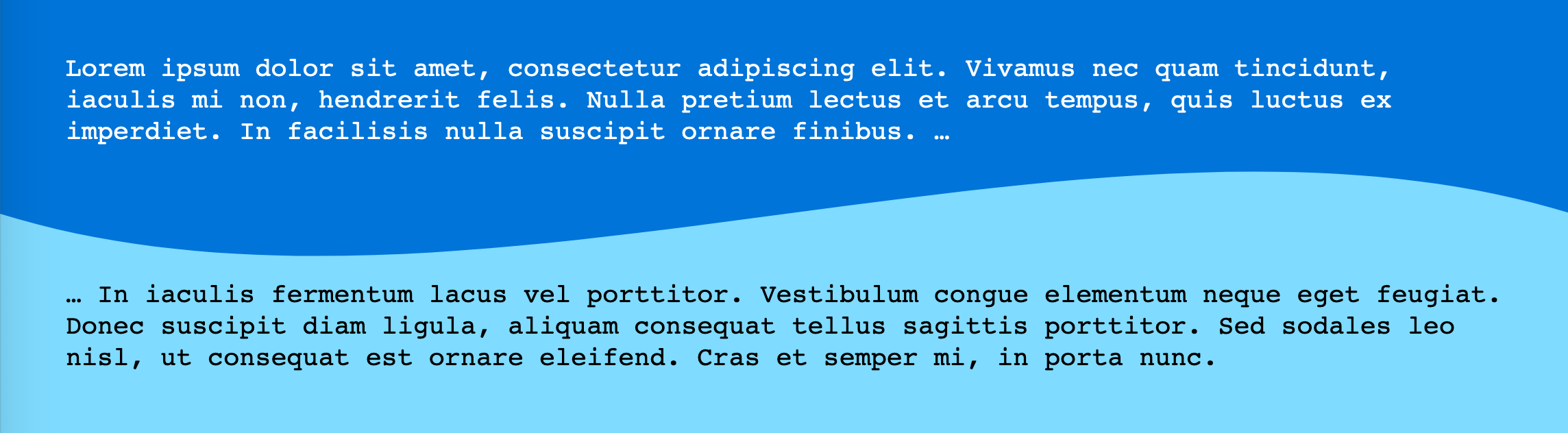
}<div id="A">Lorem ipsum dolor sit amet, consectetur adipiscing elit. Vivamus nec quam tincidunt, iaculis mi non, hendrerit felis. Nulla pretium lectus et arcu tempus, quis luctus ex imperdiet. In facilisis nulla suscipit ornare finibus. …
</div>
<div id="B" class="wavy">… In iaculis fermentum lacus vel porttitor. Vestibulum congue elementum neque eget feugiat. Donec suscipit diam ligula, aliquam consequat tellus sagittis porttitor. Sed sodales leo nisl, ut consequat est ornare eleifend. Cras et semper mi, in porta nunc.</div>波状の仕切りのデモ(余分なマークアップを回避するためのCSS疑似要素を使用)
インラインSVGを使用するよりも配置するのが少し難しいですが、同様に機能します。(CSSカスタムプロパティまたはプリプロセッサ変数を使用して、高さとパディングを読みやすくすることができます。)
色を編集するには、URLエンコードされたSVG自体を編集する必要があります。
(最初のデモのように)SVGの不要なスペースを取り除くためのの変更にviewBox注意してください。(別のオプションは、別のSVGを描画することです。)
ここで注意すべきもう一つのことは、それを両方向に伸ばすためのbackground-sizeセット100% 100%です。
最近、Get Wavesと呼ばれる素晴らしいツールが導入されました。このツールでは、UIから独自のウェーブを作成し、これをSVG形式にエクスポートできます。これは、https://getwaves.io/Webサイトにアクセスして楽しむのと同じくらい簡単です。
編集:
最近、新しいツールも発見しました-https://shapeivider.app/
ここだ別のそれを行う方法は:)コンセプトは片側として波にクリップパスポリゴンを作成することです。
このアプローチはかなり柔軟です。波が現れる位置(左、右、上、下)を変更したり、波動関数を[0,1]にマップされる任意の関数(t)に変更したりできます。ポリゴンはシェイプアウトサイドにも使用できます。これにより、「左」または「右」の方向にあるときにテキストが波の周りを流れるようになります。
最後に、波のアニメーション化を示すコメントを外すことができる例。
function PolyCalc(f /*a function(t)  from [0, infinity) => [0, 1]*/,
                  s, /*a slice function(y, i) from y [0,1] => [0, 1], with slice index, i, in [0, n]*/
									w /*window size in seconds*/,
                  n /*sample size*/,
                  o /*orientation => left/right/top/bottom - the 'flat edge' of the polygon*/
                  )
{
	this.polyStart = "polygon(";
  this.polyLeft = this.polyStart + "0% 0%, "; //starts in the top left corner
  this.polyRight = this.polyStart + "100% 0%, "; //starts in the top right corner
  this.polyTop = this.polyStart + "0% 0%, "; // starts in the top left corner
  this.polyBottom = this.polyStart + "0% 100%, ";//starts in the bottom left corner

  var self = this;
  self.mapFunc = s;
  this.func = f;
  this.window = w;
  this.count = n;
  var dt = w/n;

  switch(o) {
    case "top":
      this.poly = this.polyTop; break;
    case "bottom":
      this.poly = this.polyBottom; break;
  	case "right":
    	this.poly = this.polyRight; break;
  	case "left":
  	default:
  		this.poly = this.polyLeft; break;
    }

  this.CalcPolygon = function(t) {
  	var p = this.poly;
    for (i = 0; i < this.count; i++) {
      x = 100 * i/(this.count-1.0);
      y = this.func(t + i*dt);
      if (typeof self.mapFunc !== 'undefined')
      	y=self.mapFunc(y, i);
      y*=100;
      switch(o) {
        case "top":
          p += x + "% " + y + "%, "; break;
        case "bottom":
          p += x + "% " + (100-y) + "%, "; break;
      	case "right":
        	p += (100-y) + "% " + x + "%, "; break;
      	case "left":
        default:
        	p += y + "% " + x + "%, "; break;
      }
    }

    switch(o) {
      case "top":
        p += "100% 0%)"; break;
      case "bottom":
        p += "100% 100%)";
        break;
    	case "right":
      	p += "100% 100%)"; break;
    	case "left":
      default:
      	p += "0% 100%)"; break;
    }

    return p;
  }
};

var text = document.querySelector("#text");
var divs = document.querySelectorAll(".wave");
var freq=2*Math.PI; //angular frequency in radians/sec
var windowWidth = 1; //the time domain window which determines the range from [t, t+windowWidth] that will be evaluated to create the polygon
var sampleSize = 60;
divs.forEach(function(wave) {
  var loc = wave.classList[1];

  var polyCalc = new PolyCalc(
	  function(t) { //The time domain wave function
  	  return (Math.sin(freq * t) + 1)/2; //sine is [-1, -1], so we remap to [0,1]
    },
    function(y, i) { //slice function, takes the time domain result and the slice index and returns a new value in [0, 1]
      return MapRange(y, 0.0, 1.0, 0.65, 1.0);  //Here we adjust the range of the wave to 'flatten' it out a bit.  We don't use the index in this case, since it is irrelevant
    },
    windowWidth, //1 second, which with an angular frequency of 2pi rads/sec will produce one full period.
    sampleSize, //the number of samples to make, the larger the number, the smoother the curve, but the more pionts in the final polygon
    loc //the location
  );

    var polyText = polyCalc.CalcPolygon(0);
    wave.style.clipPath = polyText;
    wave.style.shapeOutside = polyText;
    wave.addEventListener("click",function(e) {document.querySelector("#polygon").innerText = polyText;});
  });

function MapRange(value, min, max, newMin, newMax) {
  return value * (newMax - newMin)/(max-min) + newMin;
}

//Animation - animate the wave by uncommenting this section
//Also demonstrates a slice function which uses the index of the slice to alter the output for a dampening effect.
/*
var t = 0;
var speed = 1/180;

var polyTop = document.querySelector(".top");

var polyTopCalc = new PolyCalc(
	  function(t) {
  	  return (Math.sin(freq * t) + 1)/2;
    },
    function(y, i) {
      return MapRange(y, 0.0, 1.0, (sampleSize-i)/sampleSize, 1.0);
    },
    windowWidth, sampleSize, "top"
  );

function animate() {
		var polyT = polyTopCalc.CalcPolygon(t);
    t+= speed;
    polyTop.style.clipPath = polyT;
    requestAnimationFrame(animate);
}

requestAnimationFrame(animate);
*/
div div {
padding:10px;
/*overflow:scroll;*/
}
.left {
height:100%;
width:35%;
float:left;
}
.right {
height:200px;
width:35%;
float:right;
}
.top {
width:100%;
height: 200px;
}
.bottom {
width:100%;
height:200px;
}
.green {
background:linear-gradient(to bottom, #b4ddb4 0%,#83c783 17%,#52b152 33%,#008a00 67%,#005700 83%,#002400 100%);
}
.mainContainer {
width:100%;
float:left;
}
#polygon {
padding-left:20px;
margin-left:20px;
width:100%;
}<div class="mainContainer">
<div class="wave top green">
Click to see the polygon CSS
</div>
<!--div class="wave left green">
</div-->
<!--div class="wave right green">
</div-->
<!--div class="wave bottom green"></div-->
</div>
<div id="polygon"></div>