Android:ボタンまたはImageButtonでテキストと画像を組み合わせる


540

ボタンに画像を(背景として)配置し、実行時に何が起こっているかに応じて、画像の上/上にテキストを動的に追加しようとしています。

私が使用する場合ImageButton、テキストを追加することすらできません。私が使用する場合Button、テキストを追加できますが、ここでandroid:drawableBottom定義されているのと同様のXML属性を持つ画像のみを定義します

ただし、これらの属性は、xとyの次元でテキストと画像を組み合わせるだけです。つまり、テキストの下/下(z軸がディスプレイから出ていると定義されている場合)ではなく、テキストの周囲に画像を描画できます。

これを行う方法に関する提案はありますか?1つのアイデアは、-methodを拡張するButtonImageButton、またはオーバーライドすることdraw()です。しかし、私の現在の知識レベルでは、これを行う方法(2Dレンダリング)が本当にわかりません。たぶん、より経験豊富な誰かが解決策を知っているか、少なくとも開始するためのいくつかの指針を知っていますか?


9Patch、スマートソリューションを使用
Kaveh Garshasp 2015

あなたができるかどうHI @Charuはකこれをチェックしてくださいstackoverflow.com/questions/42968587/...
モハメドRihan

回答:


205

あなたは呼び出すことができますsetBackground()上のButtonボタンの背景を設定します。

テキストは背景の上に表示されます。

xmlで同様のものを探している場合 android:background、同じように機能する属性があります。


49
このルートを使用する場合、背景に単純なドローアブルを使用するだけでは不十分です。StateListDrawableを使用して(通常はres / drawable /の<selector> XMLファイルを介して)、さまざまな状態(通常、押されている、フォーカスされている、無効など)の背景を定義できます。
CommonsWare、2009年

:この質問と私の答えのために見て、あなたに同意stackoverflow.com/questions/1533038/...
m_vitaly

1
なんてばかな。ドキュメントでそれをどのようにして見逃したのでしょうか。素早い回答と<selector>のヒントに感謝します。これは間違いなく将来実装したいことです。
znq 2009年

3
ICS 4.0以降のバージョンでは正しく機能せず、画像が引き伸ばされます。背景付きのTextViewを使用していました。
まあまあ

612

背景、アイコン画像、テキストを Button別のファイルから1つに配置したいユーザーの場合:Button背景、drawableTop / Bottom / Rigth / Left、およびpadding属性に設定します。

<Button
        android:layout_width="wrap_content"
        android:layout_height="wrap_content"
        android:background="@drawable/home_btn_test"
        android:drawableTop="@drawable/home_icon_test"
        android:textColor="#FFFFFF"
        android:id="@+id/ButtonTest"
        android:paddingTop="32sp"
        android:drawablePadding="-15sp"
        android:text="this is text"></Button>

より洗練された配置の場合は、RelativeLayout(または他のレイアウト)を使用してクリック可能にすることもできます。

チュートリアル:両方のケースをカバーする素晴らしいチュートリアル:http : //izvornikod.com/Blog/tabid/82/EntryId/8/Creating-Android-button-with-image-and-text-using-relative-layout.aspx


70
これをプログラムで行うb.setCompoundDrawablesWithIntrinsicBound(null,R.drawable.home_icon_test,null,null)にはandroid:drawableTop、のb.setPadding(0,32,0,0)代わりに、の代わりにを使用しますandroid:paddingTop
Alex Jasmin、2010年

3
レイアウトをボタンとして使用することは、実際には非常に柔軟なアプローチです。
2015年

2
あなたのドローアブルのためのリソースIDを使用している場合だけで0とヌルを置き換える

1
ボタンに合わせて背景画像をどのようにスケーリングできますか?
Alston 2014

@Stallman XMLベースとスケーリングのためのコード・ベースのソリューションがあります:stackoverflow.com/questions/8223936/...
OneWorldの

346

この問題には、はるかに優れた解決策があります。

通常のButton方法で、drawableLeftおよびgravity属性を使用します。

<Button
  android:layout_width="fill_parent"
  android:layout_height="wrap_content"
  android:drawableLeft="@drawable/my_btn_icon"
  android:gravity="left|center_vertical" />

このようにして、ボタンの左側にアイコンを表示するボタンと、垂直に中央揃えされたアイコンの右側のサイトにテキストを表示します。


2
ボタンの背景色を選択した場合、この解決策で問題が発生します(この場合は可能性があります)。そうすると、クリックや選択に対するグラフィカルな応答はなくなります。これを処理するセレクターを作成することはできますが、電話のデフォルトの色は取得できません。
Vanja

9
このソリューションを使用する場合、Drawableパディングプロパティを追加すると非常に便利です。
NikolaMalešević12年

5
XMLでドローアブルアイコンの高さと幅を設定する方法はありますか?
ペングル2012

18
これは優れたソリューションであり、Androidデベロッパーサイト(developer.android.com/guide/topics/ui/controls/button.html
twaddington、2007

3
ボタンが大きく、テキストが長い場合、見苦しいように見えます。アイコンは左端にあり、テキストは中央のどこかにあります

67

ここに画像の説明を入力してください

     <Button
            android:layout_width="0dp"
            android:layout_weight="1"
            android:background="@drawable/home_button"
            android:drawableLeft="@android:drawable/ic_menu_edit"
            android:drawablePadding="6dp"
            android:gravity="left|center"
            android:height="60dp"
            android:padding="6dp"
            android:text="AndroidDhina"
            android:textColor="#000"
            android:textStyle="bold" />

4
シンプルで間違ったソリューション。左揃えのみ。
CoolMind

2
@ CoolMind私が添付した上の画像についてのみ説明しています..右揃えが必要な場合は、drawableRightを使用してください
Dhina k

私はこの答えを読むまで、これを行うことさえ考えていませんでした。これは魅力のように機能します!
sud007

58

LinearLayoutを使用して、それがButton-の設定でbackgroundあり、クリック可能であることが重要です。

<LinearLayout
    android:id="@+id/button"
    android:layout_width="wrap_content"
    android:layout_height="wrap_content"
    android:background="@android:drawable/btn_default"
    android:clickable="true"
    android:orientation="horizontal" >

    <ImageView
        android:id="@+id/img"
        android:layout_width="wrap_content"
        android:layout_height="wrap_content"
        android:layout_gravity="center_vertical"
        android:layout_marginLeft="5dp"
        android:src="@drawable/image" />

    <TextView
        android:id="@+id/textView2"
        android:layout_width="wrap_content"
        android:layout_height="wrap_content"
        android:layout_gravity="center_vertical"
        android:layout_margin="5dp"
        android:text="Do stuff" />
</LinearLayout>

1
クリック効果を追加するには?
フランキー語2013

3
最良の答えは、この方法でルックアンドフィールを100%管理し、アイコンを境界線に貼り付ける必要がないことです。
2013

android:onClick
フランキー

43

交換するだけ

android:background="@drawable/icon"

android:background="@android:color/transparent"
android:drawableTop="@drawable/[your background image here]"

かなりいいトリックだよ..;)


21

私はここで述べたものとは異なるアプローチをとりました、そしてそれは本当にうまく機能しているので、それを共有したいと思いました。

スタイルを使用して、左側に画像、中央右側にテキストを含むカスタムボタンを作成しています。以下の4つの「簡単な手順」に従ってください。

I. /YOUR_OWN_PATH/android-sdk-mac_x86/tools/./draw9patchにある少なくとも3つの異なるPNGファイルとツールを使用して9つのパッチを作成します。この後、あなたは持っているべきです:

button_normal.9.png、button_focused.9.png、button_pressed.9.png

次に、24x24 PNGアイコンをダウンロードまたは作成します。

ic_your_icon.png

すべてをAndroidプロジェクトのdrawable /フォルダーに保存します。

II。プロジェクトのdrawable /フォルダーの下にbutton_selector.xmlというXMLファイルを作成します。状態は次のようになります。

<item android:state_pressed="true" android:drawable="@drawable/button_pressed" />
<item android:state_focused="true" android:drawable="@drawable/button_focused" />
<item android:drawable="@drawable/button_normal" />

III。values /フォルダーに移動し、styles.xmlファイルを開くか作成して、次のXMLコードを作成します。

<style name="ButtonNormalText" parent="@android:style/Widget.Button">
    <item name="android:textColor" >@color/black</item>
    <item name="android:textSize" >12dip</item>
    <item name="android:textStyle" >bold</item>
    <item name="android:height" >44dip</item>
    <item name="android:background" >@drawable/button_selector</item>
    <item name="android:focusable" >true</item>
    <item name="android:clickable" >true</item>
</style>

<style name="ButtonNormalTextWithIcon" parent="ButtonNormalText">
    <item name="android:drawableLeft" >@drawable/ic_your_icon</item>
</style>

ButtonNormalTextWithIconは、ButtonNormalText(「親スタイル」)を拡張しているため、「子スタイル」です。

ButtonNormalTextWithIconスタイルのdrawableLeftを、drawableRight、drawableTop、またはdrawableBottomに変更すると、テキストに対してアイコンを別の位置に配置できることに注意してください。

IV。UIのXMLがあるlayout /フォルダーに移動し、スタイルを適用するボタンに移動して、次のようにします。

<Button android:id="@+id/buttonSubmit" 
android:text="@string/button_submit" 
android:layout_width="fill_parent" 
android:layout_height="wrap_content" 
style="@style/ButtonNormalTextWithIcon" ></Button>

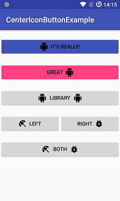
そして...ほら!左側に画像のあるボタンが表示されます。

私にとっては、これがより良い方法です!このようにすると、表示するアイコンとは別にボタンのテキストサイズを管理でき、スタイルを使用したAndroid UIガイドラインに準拠するアイコンが異なる複数のボタンに同じ背景ドローアブルを使用できます。

アプリのテーマを作成して「親スタイル」を追加し、すべてのボタンが同じように見えるようにして、必要な場所にのみアイコンを使用して「子スタイル」を適用することもできます。


よくできました。ImageLayoutビューアプローチを内部で使用していたが、このアプローチの方が優れている。
pilcrowpipe 2013年

素晴らしいアプローチ。Facebook SDK(バージョン3)は、ログインボタンに同じアプローチを採用しています
Someone Somewhere

12
 <Button android:id="@+id/imeageTextBtn" 
        android:layout_width="240dip"
        android:layout_height="wrap_content"
        android:text="Side Icon With Text Button"
        android:textSize="20sp"
        android:drawableLeft="@drawable/left_side_icon"         
        />   

11

画像にdrawableTopdrawableLeftまたはなど)を使用し、画像の下にテキストを設定するには、gravity left|center_vertical

<Button
            android:id="@+id/btn_video"
            android:layout_width="wrap_content"
            android:layout_height="wrap_content"
            android:layout_alignParentRight="true"
            android:layout_centerVertical="true"
            android:background="@null"
            android:drawableTop="@drawable/videos"
            android:gravity="left|center_vertical"
            android:onClick="onClickFragment"
            android:text="Videos"
            android:textColor="@color/white" />

11

重要な更新

通常のandroid:drawableLeftetc ...をベクタードローアブルで使用しないでください。他のAPIバージョンではクラッシュます。(私はライブアプリで直面しています)

ベクタードローアブル

ベクタードローアブルを使用している場合は、

  • AndroidXに移行しましたか?そうでない場合は、最初にAndroidXに移行する必要があります。それは非常にシンプルです、androidxとは何か、そしてどのように移行するのかをご覧ください
  • バージョン1.1.0-alpha01でリリースされたため、appcompatバージョンは少なくともでなければなりません1.1.0-alpha01。現在の最新バージョンはです。1.1.0-alpha02信頼性を高めるには最新バージョンを使用してください。リリースノートを参照してください- リンク

    implementation 'androidx.appcompat:appcompat:1.1.0-alpha02'

  • AppCompatTextView/ AppCompatButton/を使用AppCompatEditText

  • 使用app:drawableLeftCompatapp:drawableTopCompatapp:drawableRightCompatapp:drawableBottomCompatapp:drawableStartCompatおよびapp:drawableEndCompat

通常のドローアブル用

ベクタードローアブルが必要ない場合は、

  • 使用android:drawableLeftandroid:drawableRightandroid:drawableBottomandroid:drawableTop
  • あなたは、通常のいずれかを使用することができTextViewButtonEditTextまたはAppCompatクラスを。

以下のような出力を達成できます-

出力


私はxmlns:app="http://schemas.android.com/apk/res-auto"名前空間を使用しており、それらのアプリの互換性のあるものが表示されません。
デール

1
@Daleあなたの名前空間は正しいです、私は私の答えを更新しました、For vector drawableもう一度ポイントを参照してください。
ケムラジ

@Khemrajアタッチした画像に表示されているように、ドローアブルとテキストの両方を単一のビュー(TextViewまたはButtonなど)の中央に配置する方法を教えてください。
Ambar Jain

7

おそらく私のソリューションは多くのユーザーに適していると思います。

私が提案しているのは、あなたのスタイルでTextViewを作ることです。私にとっては完璧に機能し、ボタンなどのすべての機能を備えています。

まず最初に、ボタンのスタイルを作成します。これはどこでも使用できます...私はbutton_with_hover.xmlを作成しています

    <?xml version="1.0" encoding="utf-8"?>
<selector xmlns:android="http://schemas.android.com/apk/res/android">
    <item android:state_pressed="true" >
        <shape android:shape="rectangle"  >
            <corners android:radius="3dip" />
            <stroke android:width="1dip" android:color="#8dbab3" />
            <gradient android:angle="-90" android:startColor="#48608F" android:endColor="#48608F"  />
        </shape>

        <!--#284682;-->
        <!--border-color: #223b6f;-->
    </item>
    <item android:state_focused="true">
        <shape android:shape="rectangle"  >
            <corners android:radius="3dip" />
            <stroke android:width="1dip" android:color="#284682" />
            <solid android:color="#284682"/>
        </shape>
    </item>
    <item >
        <shape android:shape="rectangle"  >
            <corners android:radius="3dip" />
            <stroke android:width="1dip" android:color="@color/ControlColors" />
            <gradient android:angle="-90" android:startColor="@color/ControlColors" android:endColor="@color/ControlColors" />
        </shape>
    </item>

</selector>

次に、textviewボタンを作成しましょう。

    <TextView
    android:layout_width="wrap_content"
    android:layout_height="wrap_content"
    android:layout_marginBottom="20dip"
    android:layout_gravity="right|bottom"
    android:gravity="center"
    android:padding="12dip"
    android:background="@drawable/button_with_hover"
    android:clickable="true"
    android:drawableLeft="@android:drawable/btn_star_big_off"
    android:textColor="#ffffffff"
    android:text="Golden Gate" />

そして、これは結果です。次に、任意の色またはその他のプロパティとマージンでカスタムボタンのスタイルを設定します。幸運を

ここに画像の説明を入力してください


アプローチは正しいように思われるため、まだコードをテストしていませんが、モバイルアプリでホバー効果が発生する理由がわかりません。
Mohammed Akhtar Zuberi 2018年

アプリにホバー効果を作成しましたが、そのアプリのビルド中にホバー効果が必要でした。しかし、それはあなた次第です:)必要がなければ、ホバー効果を削除できます。
Jevgenij Kononov 2018年

非常に良いアプローチなので、私はあなたの回答に投票しました。私の唯一のポイントは、モバイルインターフェイス上にあります。
Mohammed Akhtar Zuberi 2018年

うーん…なるほど。。:Dうん、そうだね。それは無理だ。そのホバー効果は主に押す効果のためです。xmlクラスの名前が正しくない
Jevgenij Kononov


5

このコードは私にとって完璧に機能します

<LinearLayout
    android:id="@+id/choosePhotosView"
    android:layout_width="match_parent"
    android:layout_height="wrap_content"
    android:orientation="horizontal"
    android:gravity="center"
    android:clickable="true"
    android:background="@drawable/transparent_button_bg_rev_selector">

    <ImageView
        android:layout_width="wrap_content"
        android:layout_height="wrap_content"
        android:src="@drawable/choose_photo"/>

     <TextView
        android:layout_width="wrap_content"
        android:layout_height="wrap_content"
        android:textColor="@android:color/white"
        android:text="@string/choose_photos_tv"/>

</LinearLayout>

私はあなたのコードを試しました..それは機能しますが、ボタンのセットがあり、各ボタンに異なるテキストサイズがある場合、コードの主な問題です。レイアウトがずれます。したがって、ボタンの各画像の位置は異なる場所になります。中央がまっすぐなはずですが。これはボタンで何が起こるかです。
Jevgenij Kononov 2017

0

あなたはこれを使うことができます:

  <Button
                    android:id="@+id/reset_all"
                    android:layout_width="wrap_content"
                    android:layout_height="wrap_content"
                    android:layout_marginRight="5dp"
                    android:layout_weight="1"
                    android:background="@drawable/btn_med"
                    android:text="Reset all"
                    android:textColor="#ffffff" />

                <Button
                    android:id="@+id/undo"
                    android:layout_width="wrap_content"
                    android:layout_height="wrap_content"
                    android:layout_marginLeft="5dp"
                    android:layout_weight="1"
                    android:background="@drawable/btn_med"
                    android:text="Undo"
                    android:textColor="#ffffff" />

ということで、画像をbackground追加し、テキストも追加しました。


0
<Button android:id="@+id/myButton" 
    android:layout_width="150dp"
    android:layout_height="wrap_content"
    android:text="Image Button"
    android:drawableTop="@drawable/myimage"         
    />  

または、プログラムで行うこともできます。

Drawable drawable = getResources.getDrawable(R.drawable.myimage);
drawable.setBounds(0, 0, 60, 60);
myButton.setCompoundDrawables(null, drawable, null, null);//to the Top of the Button

-4
    <ImageView
        android:id="@+id/iv"
        android:layout_width="match_parent"
        android:layout_height="match_parent"
        android:scaleType="centerCrop"
        android:src="@drawable/temp"
        />

画像ビューはテキストをサポートしないため、これは正しい答えではありません
Muhammed
弊社のサイトを使用することにより、あなたは弊社のクッキーポリシーおよびプライバシーポリシーを読み、理解したものとみなされます。
Licensed under cc by-sa 3.0 with attribution required.