Twitterブートストラップモーダルボックスのデフォルトの幅を変更するにはどうすればよいですか?


373

私は以下を試しました:

   <div class="modal hide fade modal-admin" id="testModal" style="display: none;">
        <div class="modal-header">
          <a data-dismiss="modal" class="close">×</a>
          <h3 id='dialog-heading'></h3>
        </div>
        <div class="modal-body">
            <div id="dialog-data"></div>
        </div>
        <div class="modal-footer">
          <a data-dismiss="modal" class="btn" >Close</a>
          <a class="btn btn-primary" id="btnSaveChanges">Save changes</a>
        </div>
    </div>

そしてこのJavascript:

    $('.modal-admin').css('width', '750px');
    $('.modal-admin').css('margin', '100px auto 100px auto');
    $('.modal-admin').modal('show')

結果は私が期待したものではありません。モーダル左上が画面の中央に配置されます。

誰かが私を助けてくれますか?他の誰かがこれを試しましたか?私がしたいことは珍しいことではないと思います。


Bootstrapプラグインには、それほど多くのオプションがないようです。ブートストラップCSSファイルでクラスを見つけて、CSSを介して設定されているかどうかを確認してください。上書きできるか、少なくとも、どの要素であるかについての手掛かりが得られるはずです。
GillesC 2012

3
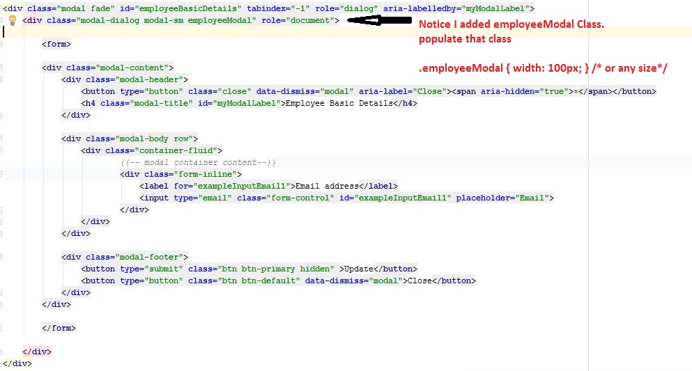
Nick Nからの回答を見て、非常に優れた応答を見つけてください!stackoverflow.com/a/16090509/539484
OnTheFly 2013

回答:


373

更新:

ではbootstrap 3、あなたは、モーダルダイアログを変更する必要があります。したがって、この場合はmodal-adminmodal-dialog立っている場所にクラスを追加できます。

元の回答(ブートストラップ<3)

JS / jQueryでそれを変更しようとしている特定の理由はありますか?

CSSだけで簡単に作成できます。つまり、ドキュメントでスタイルを設定する必要はありません。独自のカスタムCSSファイルに、以下を追加します。

body .modal {
    /* new custom width */
    width: 560px;
    /* must be half of the width, minus scrollbar on the left (30px) */
    margin-left: -280px;
}

あなたの場合:

body .modal-admin {
    /* new custom width */
    width: 750px;
    /* must be half of the width, minus scrollbar on the left (30px) */
    margin-left: -375px;
}

セレクターの前にボディを置く理由は、デフォルトよりも優先度が高くなるようにするためです。この方法でカスタムCSSファイルに追加でき、心配することなくBootstrapを更新できます。


2
@NickNのおかげで、下にスクロールしてより良い(レスポンシブ)回答を見つけてください!
OnTheFly 2013

1
あなたはそれが応答することができます@FloatingRock、私の答えを見て
ニック・N.

1
@NickN。キラー!ありがとうニック
FloatingRock

47
Bootstrap 3はこれを簡単にします。.modal .modal-dialog { width: 800px; }左側の位置は自動的に計算されます。
Gavin

1
実際、これは私にはうまくいきません。@ZimSystemによってコメントで与えられたソリューションがトリックをしました。
tonjo 2017年

270

CSSだけで応答可能にする場合は、次のようにします。

.modal.large {
    width: 80%; /* respsonsive width */
    margin-left:-40%; /* width/2) */ 
}

注1:私は.largeクラスを使用しましたが、これは通常でも行うことができます.modal

注2:Bootstrap 3では、負のmargin-leftは不要になる可能性があります (個人的に確認されていません)

/*Bootstrap 3*/
.modal.large {
     width: 80%;
}

注3:Bootstrap 3および4には modal-lgクラスがあります。したがって、これで十分な場合もありますが、応答可能にしたい場合は、Bootstrap 3用に提供した修正が必要です。

一部のアプリケーションではfixedモーダルが使用されますが、その場合は試すことができますwidth:80%; left:10%;(式:左= 100-幅/ 2)


これにより、非常に狭い画面でモーダルが画面から半分表示されるようになります。
cofiem 2013年

5
コフィエム、これを修正するためにメディアクエリを使用する
ニックN.

1
@NickN。私のメディアクエリはそれを修正しませんでした。例を追加できますか?無視して、わかった。min-widthではなくmax-widthがありました。 @media (min-width: 400px) { body .modal-lrg{ width: 80%; /* respsonsive width */ margin-left:-40%; /* width/2) */ } }
HPWD 2013年

%を使用するだけでは、すでにブートストラップに組み込まれている列を使用する場合のように、十分な制御ができません。
Alex

@アレックスそれはあなたにもっとコントロールを与えると思います、あなたは既存のカラムでどのようにそれをしますか?
Nick N.

107

ブートストラップ3を使用している場合は、受け入れられた回答に示されているようなモーダルdivではなく、モーダルダイアログdivを変更する必要があります。また、Bootstrap 3の応答性を維持するには、メディアクエリを使用してオーバーライドCSSを記述し、小さいデバイスでモーダルが全幅になるようにすることが重要です。

さまざまな幅を試すには、このJSFiddleを参照してください。

HTML

<div class="modal fade">
    <div class="modal-dialog custom-class">
        <div class="modal-content">
            <div class="modal-header">
                <button type="button" class="close" data-dismiss="modal" aria-hidden="true">&times;</button>
                <h3 class="modal-header-text">Text</h3>
            </div>
            <div class="modal-body">
                This is some text.
            </div>
            <div class="modal-footer">
                This is some text.
            </div>
        </div><!-- /.modal-content -->
    </div><!-- /.modal-dialog -->
</div><!-- /.modal -->

CSS

@media screen and (min-width: 768px) {
    .custom-class {
        width: 70%; /* either % (e.g. 60%) or px (400px) */
    }
}

3
bootstrap3用の正しいもの。マージンを調整せずに動作します!thx
SQueek、2013

1
必要ないので、答えからid属性を削除しました。
弧度

動作しますが、mlunoeまたはDaveが応答するため、応答しません。
ksiomelo 2014年

80

相対的なデザインを壊さないものが欲しいならこれを試してください:

body .modal {
  width: 90%; /* desired relative width */
  left: 5%; /* (100%-width)/2 */
  /* place center */
  margin-left:auto;
  margin-right:auto; 
}

@Marco Johannesenが言うように、セレクターの前の「本体」は、デフォルトよりも高い優先度を取るようになっています。


4
ずっと使うのではmargin-left:auto; margin-right:auto;なく単に使用することをお勧めしますauto
cwd

場合top: 30%によっては、内部のコンテンツに応じてパーセンテージが必要になることがあります。
bool.dev '19

6
これは私が.modal.fade.inルールを省略した場合にうまく機能します。これは、Bootstrap V2.2.2でモーダルを一番下まで移動します。
ラミロ2013

1
これだけでは、ページ内のCSSファイルや負荷のコードをドロップ... ...アンギュラ-UIモーダル例で働い angular-ui.github.io/bootstrap/#/modalで...実行例plnkr.co / edit / GYmc9s?p = preview
Marcello de Sales

1
素晴らしいこのソリューションは、2.3.2ブートストラップとInternet Explorer 8,9,10のMAINでうまく機能します!!!! margin-left:-40%のソリューションはInternet Explorerでは正しくありません!!!
Cioxideru 2014年

41

Bootstrap 3以降では、モーダルダイアログのサイズを変更する最も適切な方法は、sizeプロパティを使用することです。以下は例です。クラスにmodal-sm沿ってmodal-dialog、小さなモーダルを示しています。sm小、md中、lg大の値を含めることができます。

<div class="modal fade" id="ww_vergeten" tabindex="-1" role="dialog" aria-labelledby="modal_title" aria-hidden="true">
  <div class="modal-dialog modal-sm"> <!-- property to determine size -->
    <div class="modal-content">
      <div class="modal-header">
        <button type="button" class="close" data-dismiss="modal" aria-hidden="true">&times;</button>
        <h4 class="modal-title" id="modal_title">Some modal</h4>
      </div>
      <div class="modal-body">

        <!-- modal content -->

      </div>
      <div class="modal-footer">
        <button type="button" class="btn btn-primary" id="some_button" data-loading-text="Loading...">Send</button>
      </div>
    </div>
  </div>
</div>

それを私の答えに追加しました:)
Tum

3
これが一番の答えではないでしょうか?上の回答がそれをカスタマイズするのに役立つと思いますが、ほとんどのユースケースはBootstrapの組み込みクラスによって満たされるはずです。
WebSpanner 2016

Bootstrap 3.xを使用していますが、modal-mdクラスがないようです。
James Poulose 2017

34

以下のためにBootstrap 3ここでそれを行う方法です。

modal-wideHTMLマークアップにスタイルを追加します(Bootstrap 3のドキュメントの例から変更)。

<div class="modal fade modal-wide" id="myModal" tabindex="-1" role="dialog" aria-labelledby="myModalLabel" aria-hidden="true">
  <div class="modal-dialog">
    <div class="modal-content">
      <div class="modal-header">
        <button type="button" class="close" data-dismiss="modal" aria-hidden="true">&times;</button>
        <h4 id="myModalLabel" class="modal-title">Modal title</h4>
      </div>
      <div class="modal-body">
        <p>One fine body&hellip;</p>
      </div>
      <div class="modal-footer">
        <button type="button" class="btn btn-default" data-dismiss="modal">Close</button>
        <button type="button" class="btn btn-primary">Save changes</button>
      </div>
    </div><!-- /.modal-content -->
  </div><!-- /.modal-dialog -->
</div><!-- /.modal -->

次のCSSを追加します

.modal-wide .modal-dialog {
  width: 80%; /* or whatever you wish */
}

これを中央margin-leftに配置Bootstrap 3するためにオーバーライドする必要はありません。


3
混乱を避けるために、modal-wideクラスを追加する技術的な理由はありません。つまり、Bootstrapの「内部」クラスではありません。簡単にできます#myModal .modal-dialog { width: 80%; }
Gavin

1
うん。ただし、スタイルとして使用すると、再利用性が高まります。
デイブサグ2013

2
うん、わかりました。ブートストラップクラスとカスタムクラスの違いを理解するのは難しい場合が多いので、書き留めておきました。
ギャビン

20

ではブートストラップ3あなたが必要なのはこれです

<style>
    .modal .modal-dialog { width: 80%; }
</style>

上記の答えのほとんどが私にはうまくいきませんでした!!!


モーダル高さを変更する方法を知っていますか?あなたの答えをありがとう、それは魅力のように働きます:)
FrenkyB

17

このページから解決策が取られました

$('#feedback-modal').modal({
    backdrop: true,
    keyboard: true
}).css({
    width: 'auto',
    'margin-left': function () {
        return -($(this).width() / 2);
    }
});

15

Bootstrapのv3では、モーダルを大きくする簡単な方法があります。modal-dialogの隣にクラスmodal-lgを追加するだけです。

<!-- My Modal Popup -->
<div id="MyWidePopup" class="modal fade" role="dialog">
    <div class="modal-dialog modal-lg"> <---------------------RIGHT HERE!!
        <!-- Modal content-->
        <div class="modal-content">

なぜ反対票?!それは絶対にそしてきれいに、私に素敵な広いダイアログボックスを与えました!そして、「適切な」ブートストラップクラスのみを使用します!
Dave

HTML要素のいくつかをトリップしてみてください。テストするために、できるだけ簡単な構造を使用してください。
Dave

13

ブートストラップ3:小型デバイスや超小型デバイスの応答機能を維持するために、次のことを行いました。

@media (min-width: 768px) {
.modal-dialog-wide
{ width: 750px;/* your width */ }
}

それはそうです。これは私にとってはうまくいきます。レスポンシブレイアウトでは、widthプロパティをXX%に変更することを忘れないでください。ところで、私の場合のバージョンは3.0.3です
Jerry Chen

7

これは私がやったことです、私のcustom.cssでこれらの行を追加しました、そしてそれがすべてでした。

.modal-lg {
    width: 600px!important;
    margin: 0 auto;
}

もちろん、幅のサイズを変更できます。


7

Bootstrap> 3の場合、モーダルにスタイルを追加するだけです。

<div class="modal-dialog" style="width:80%;">
  <div class="modal-content">
  </div>
</div>

6

この解決策が私にとってより効果的であることがわかりました。あなたはこれを使うことができます:

$('.modal').css({
  'width': function () { 
    return ($(document).width() * .9) + 'px';  
  },
  'margin-left': function () { 
    return -($(this).width() / 2); 
  }
});

またはこれはあなたの要件に依存します:

$('.modal').css({
  width: 'auto',
  'margin-left': function () {
     return -($(this).width() / 2);
  }
});

私が見つけた投稿を参照してください:https//github.com/twitter/bootstrap/issues/675


5

FYI Bootstrap 3は、leftプロパティを自動的に処理します。したがって、このCSSを追加するだけで幅が変更され、中央に維持されます。

.modal .modal-dialog { width: 800px; }

B3のために働きました!どうもありがとう!
バガタ2013

4

レスポンシブデザインを維持し、幅を希望どおりに設定します。

.modal-content {
  margin-left: auto;
  margin-right: auto;
  max-width: 360px;
}

複雑にしないでおく。


4

クラスmodel-dialogを変更すると、期待どおりの結果が得られます。これらの小さなトリックは私にとってはうまくいきます。この問題の解決に役立つことを願っています。

.modal-dialog {
    width: 70%;
}

3

Bootstrap 3では、CSSを介してモーダルダイアログに与えられるパーセント値のみが必要です。

CSS

#alertModal .modal-dialog{
     width: 20%;
}

1
はい、occamのかみそりはこれに行きます。3.0でのテストはすばらしい
Gui de Guinetik 2013年

3

CSSとjQueryを組み合わせ、このページのヒントを使用して、Bootstrap 3を使用して滑らかな幅と高さを作成しました。

まず、コンテンツ領域の幅とオプションのスクロールバーを処理するCSS

.modal.modal-wide .modal-dialog {
  width: 90%;
}
.modal-wide .modal-body {
  overflow-y: auto;
}

そして、必要に応じてコンテンツ領域の高さを調整するいくつかのjQuery

$(".modal-wide").on("show.bs.modal", function() {
  var height = $(window).height() - 200;
  $(this).find(".modal-body").css("max-height", height);
});

http://scottpdawson.com/development/creating-a-variable-width-modal-dialog-using-bootstrap-3/の完全な記述とコード


3

ではブートストラップ3 CSSであなたは、単に使用することができます。

body .modal-dialog {
    /* percentage of page width */
    width: 40%;
}

これにより、シェーディングにも適用される.modal-dialog代わりに使用しているので、ページのデザインを壊さないことが保証されます.modal


2

次のようなものを試してください(ここでjsfiddleのライブ例を参照してください:http ://jsfiddle.net/periklis/hEThw/1/ )

<a class="btn" onclick = "$('#myModal').modal('show');$('#myModal').css('width', '100px').css('margin-left','auto').css('margin-right','auto');" ref="#myModal" >Launch Modal</a>
<div class="modal" id="myModal" style = "display:none">
  <div class="modal-header">
    <a class="close" data-dismiss="modal">×</a>
    <h3>Modal header</h3>
  </div>
  <div class="modal-body">
    <p>One fine body…</p>
  </div>
  <div class="modal-footer">
    <a href="#" class="btn">Close</a>
    <a href="#" class="btn btn-primary">Save changes</a>
  </div>
</div>​

2

パーセンテージを使用してモーダルをレスポンシブにするのではなく、すでにブートストラップに組み込まれている列やその他のレスポンシブ要素を使用することで、より多くの制御を行うことができます。


モーダルレスポンシブ/任意の数の列のサイズを作成するには:

1).containerのクラスを使用して、モーダルダイアログdivの周りに追加のdivを追加します -

<div class="container">
    <div class="modal-dialog">
    </div>
</div>


2)少しCSSを追加して、モーダルを全幅にします-

.modal-dialog {
    width: 100% }


3)別のモーダルがある場合は、別のクラスを追加します-

<div class="container">
    <div class="modal-dialog modal-responsive">
    </div>
</div>

.modal-responsive.modal-dialog {
    width: 100% }


4)さまざまなサイズのモーダルが必要な場合は、行/列を追加します-

<div class="container">
  <div class="row">
    <div class="col-md-4">
      <div class="modal-dialog modal-responsive">
       ...
      </div>
    </div>
  </div>
</div>

2

あなたのCSSファイルに以下を追加してください

.popover{
         width:auto !important; 
         max-width:445px !important; 
         min-width:200px !important;
       }

2

以下のスクリプトを使用:

.modal {
  --widthOfModal: 98%;
  width: var(--widthOfModal) !important;
  margin-left: calc(calc(var(--widthOfModal) / 2) * (-1)) !important;
  height: 92%;

  overflow-y: scroll;
}

デモ

GIFのデモ


2

Bootstrap 4.1で解決しました

以前に投稿されたソリューションの組み合わせ

.modal-lg {
  max-width: 90% !important; /* desired relative width */
  margin-left:auto !important;
  margin-right:auto !important;
}


1

を使用して期待される結果を達成しました、

.modal-dialog {
    width: 41% !important;
}

1

ブートストラップ3.xx

   <!-- Modal -->
<div class="modal fade" id="employeeBasicDetails" tabindex="-1" role="dialog" aria-labelledby="myModalLabel">
    <div class="modal-dialog modal-sm employeeModal" role="document">

        <form>

        <div class="modal-content">
            <div class="modal-header">
                <button type="button" class="close" data-dismiss="modal" aria-label="Close"><span aria-hidden="true">&times;</span></button>
                <h4 class="modal-title" id="myModalLabel">Modal Title</h4>
            </div>

            <div class="modal-body row">
                Modal Body...
            </div>

            <div class="modal-footer"> 
                <button type="button" class="btn btn-default" data-dismiss="modal">Close</button>
            </div>
        </div>

        </form>

    </div>
</div>

2番目のdivに.employeeModalクラスを追加したことに注意してください。次に、そのクラスをスタイルします。

.employeeModal{
        width: 700px;
    }

コードスニペットのスクリーンショット


0

私はこの方法を使用しました、そしてそれは私にとって完璧な仕事です

$("#my-modal")
.modal("toggle")
.css({'width': '80%', 'margin-left':'auto', 'margin-right':'auto', 'left':'10%'});

0

Bootstrap 2のベースの少ないソリューション(jsなし)

.modal-width(@modalWidth) {
    width: @modalWidth;
    margin-left: -@modalWidth/2;

    @media (max-width: @modalWidth) {
        position: fixed;
        top:   20px;
        left:  20px;
        right: 20px;
        width: auto;
        margin: 0;
        &.fade  { top: -100px; }
        &.fade.in { top: 20px; }
    }
}

次に、モーダル幅を指定したい場所に:

#myModal {
    .modal-width(700px);
}

0

私はSCSSと完全に応答性の高いモーダルを使用しました:

.modal-dialog.large {
    @media (min-width: $screen-sm-min) { width:500px; }
    @media (min-width: $screen-md-min) { width:700px; }
    @media (min-width: $screen-lg-min) { width:850px; }
} 

0
you can use any prefix or postfix name for modal. but you need to make sure that's should use everywhere with same prefix/postfix name.    

body .modal-nk {
        /* new custom width */
        width: 560px;
        /* must be half of the width, minus scrollbar on the left (30px) */
        margin-left: -280px;
    }

または

body .nk-modal {
            /* new custom width */
            width: 560px;
            /* must be half of the width, minus scrollbar on the left (30px) */
            margin-left: -280px;
        }
弊社のサイトを使用することにより、あなたは弊社のクッキーポリシーおよびプライバシーポリシーを読み、理解したものとみなされます。
Licensed under cc by-sa 3.0 with attribution required.